Chicago Chinatown Identity System Design, Rebranding
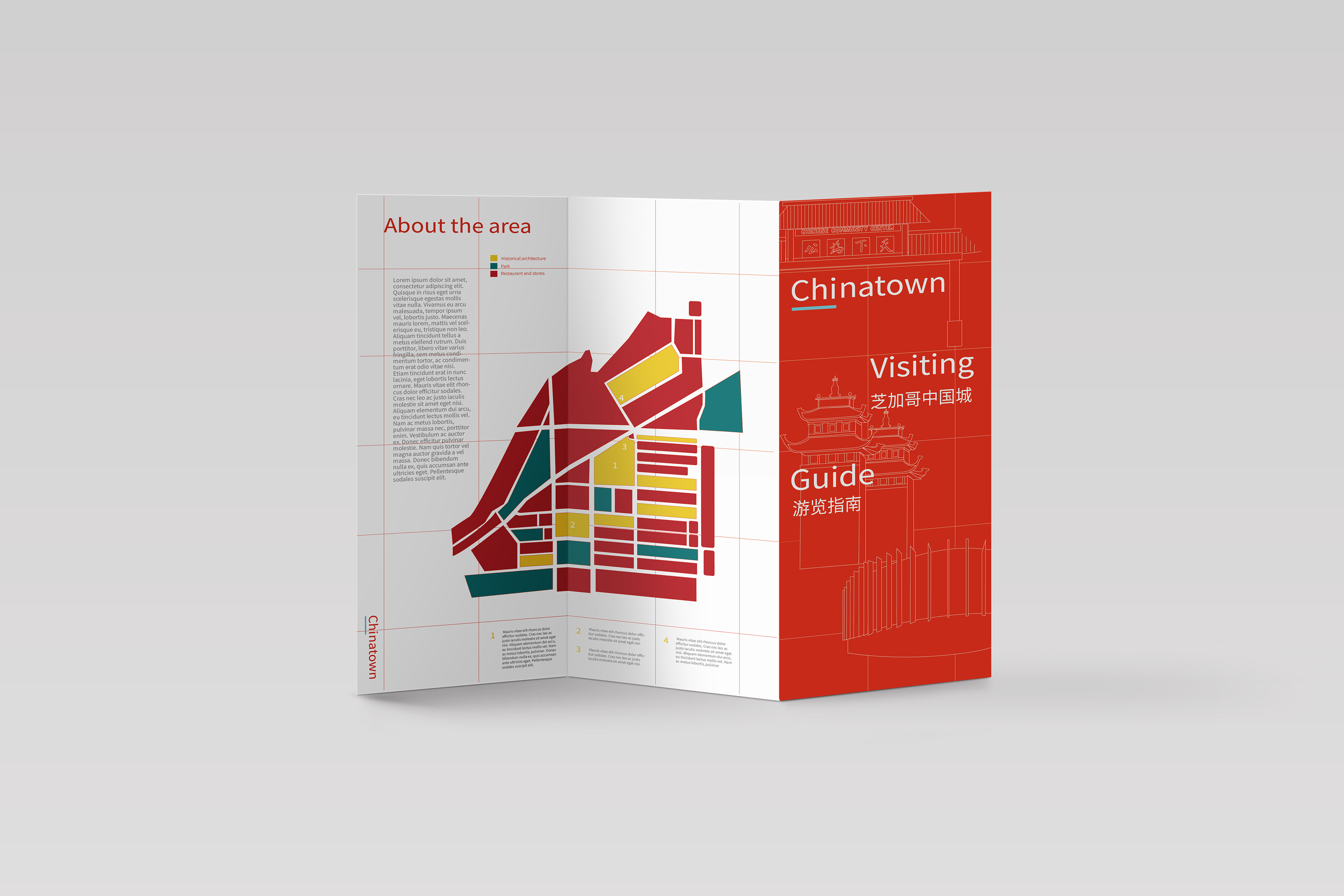
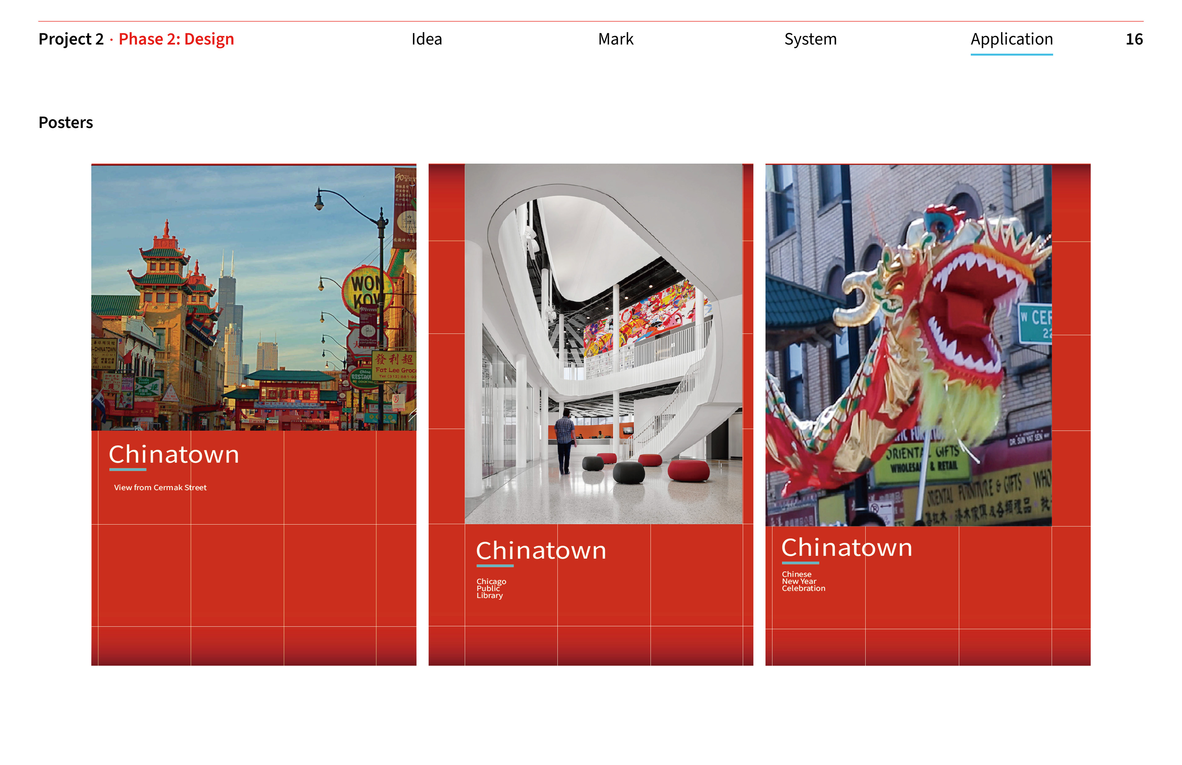
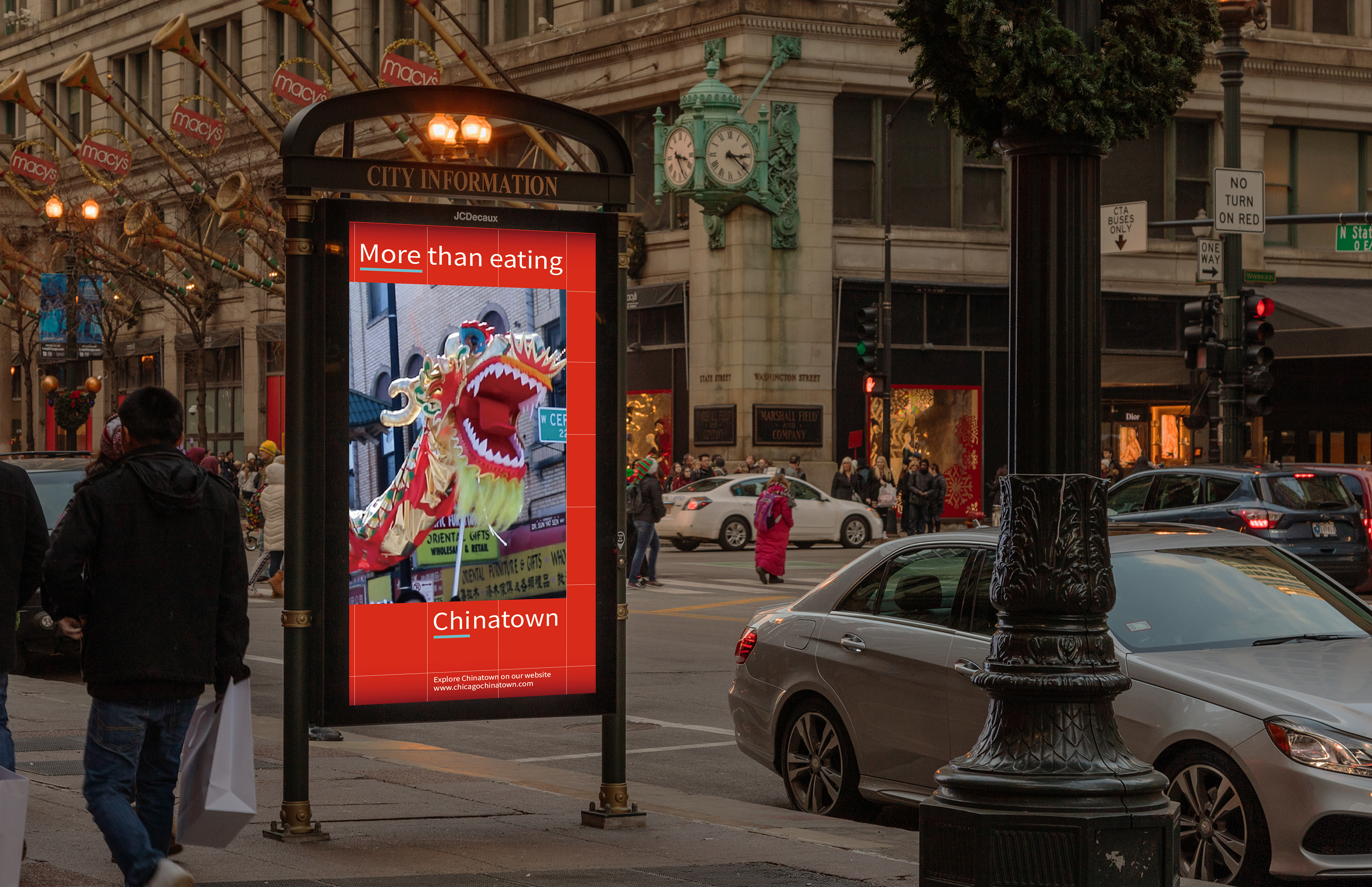
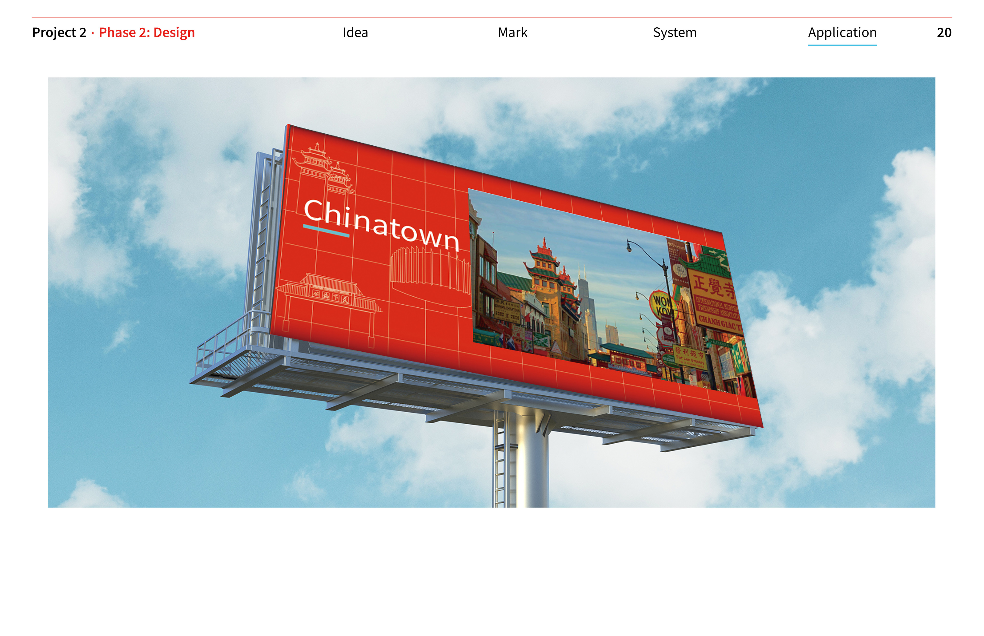
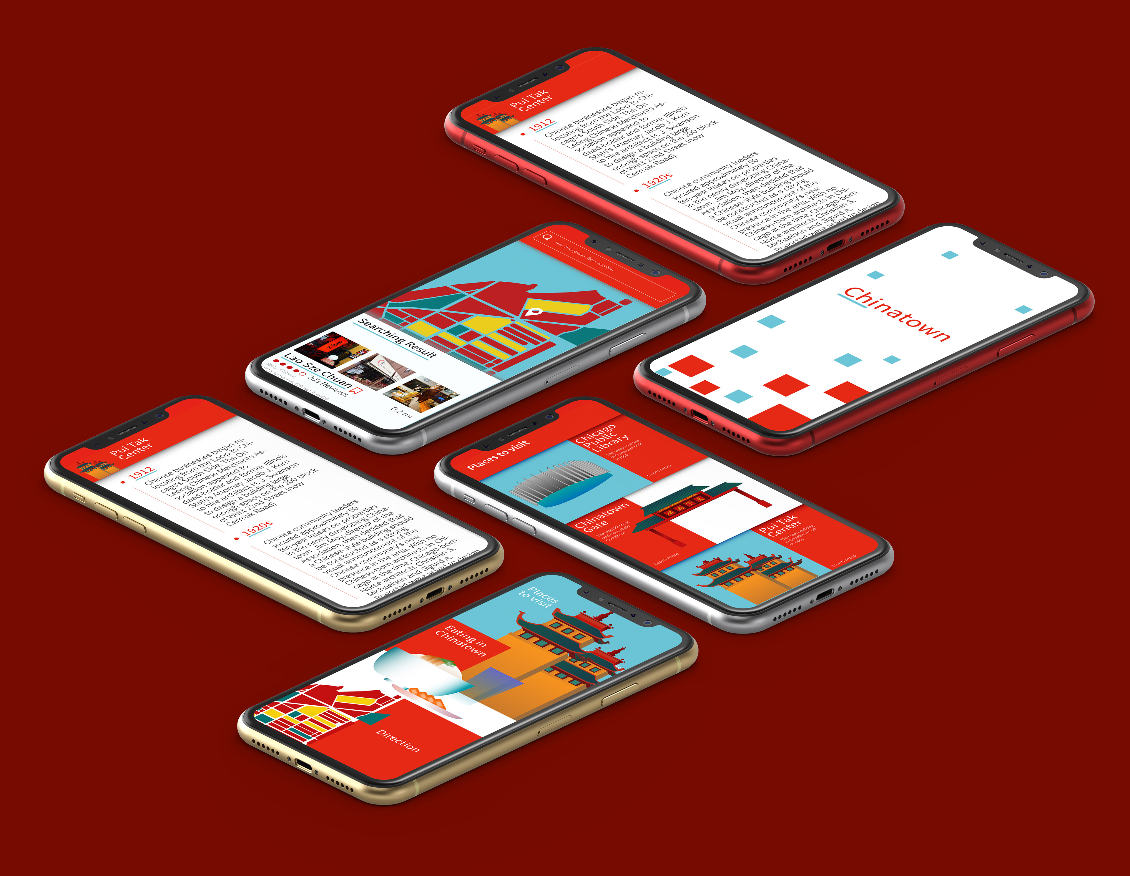
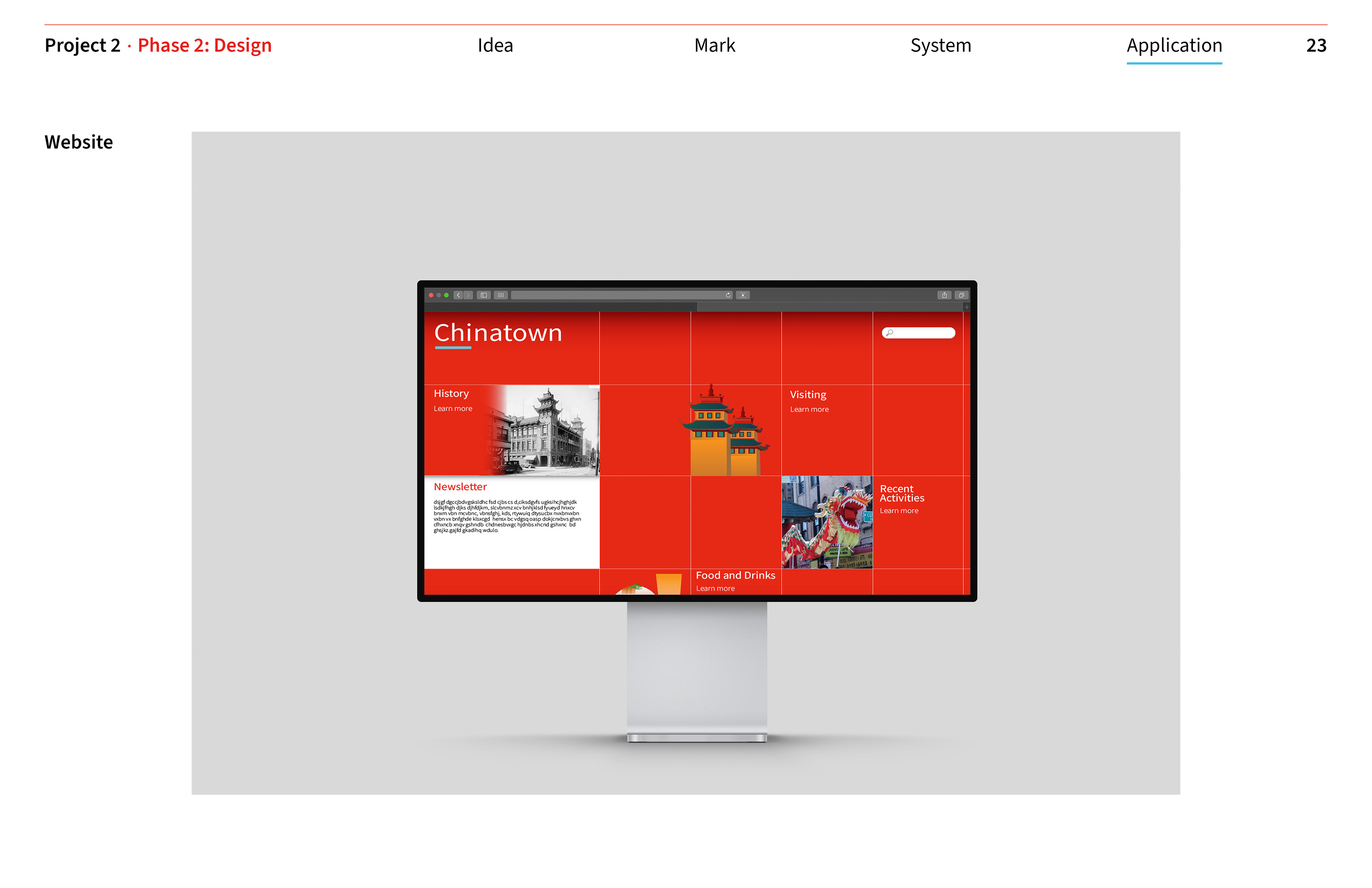
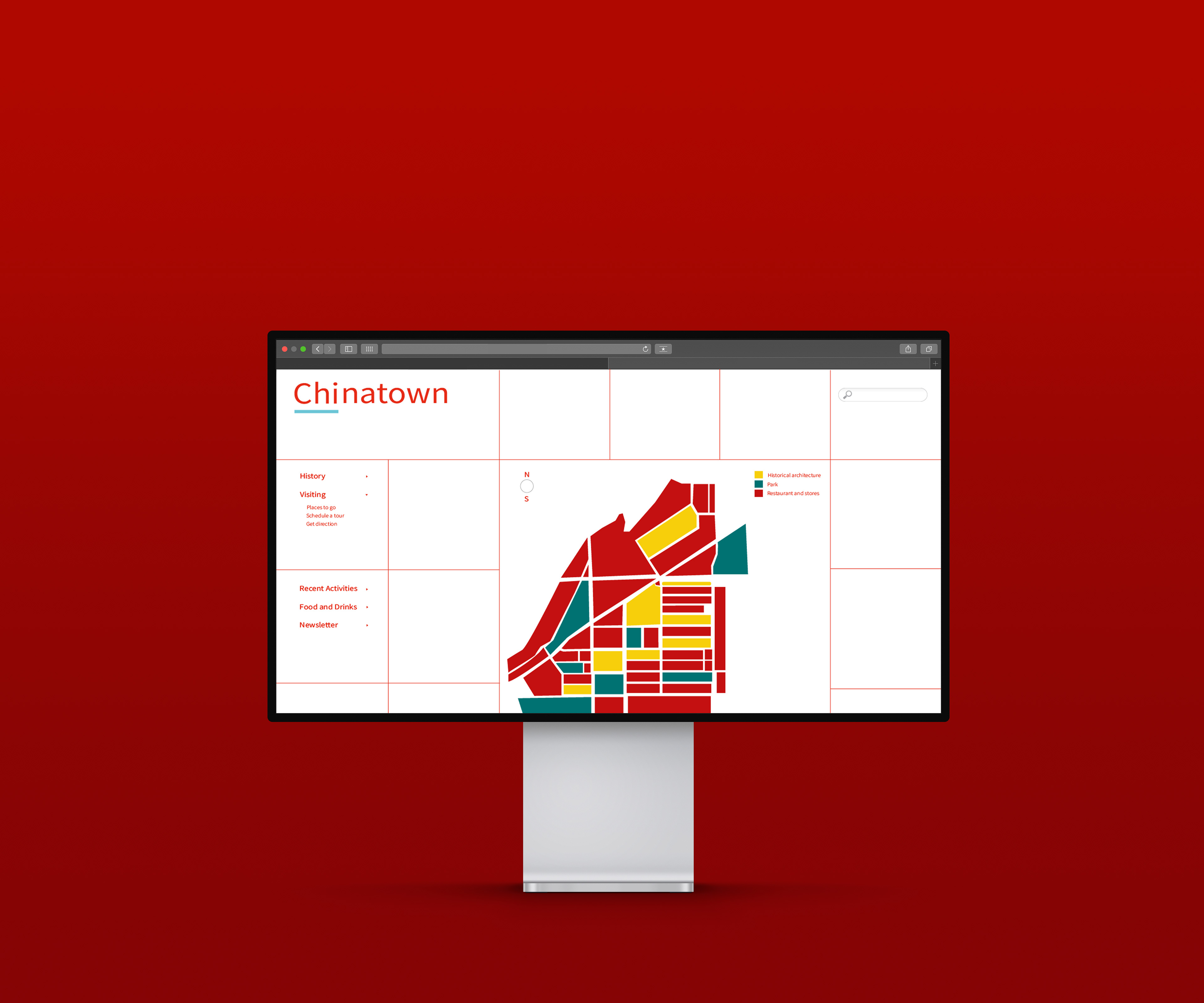
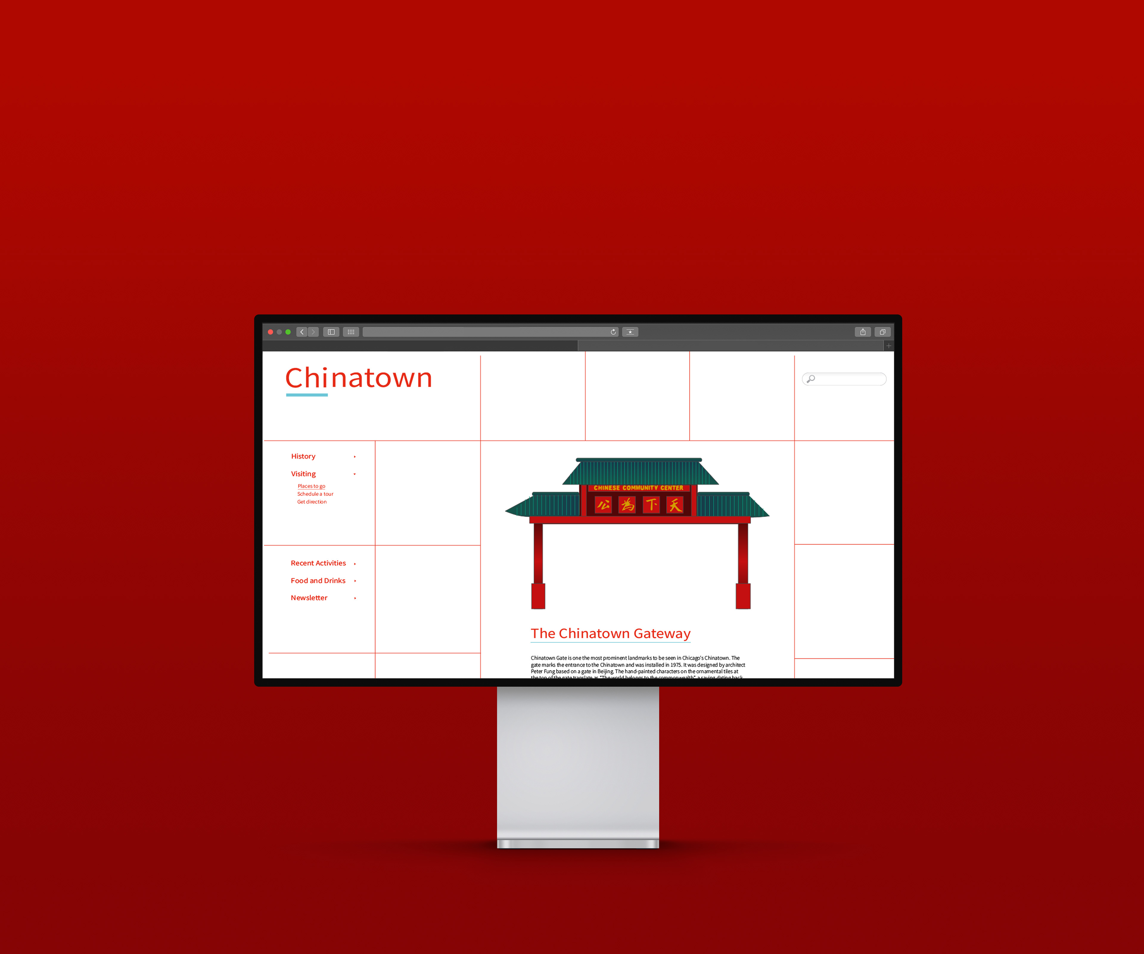
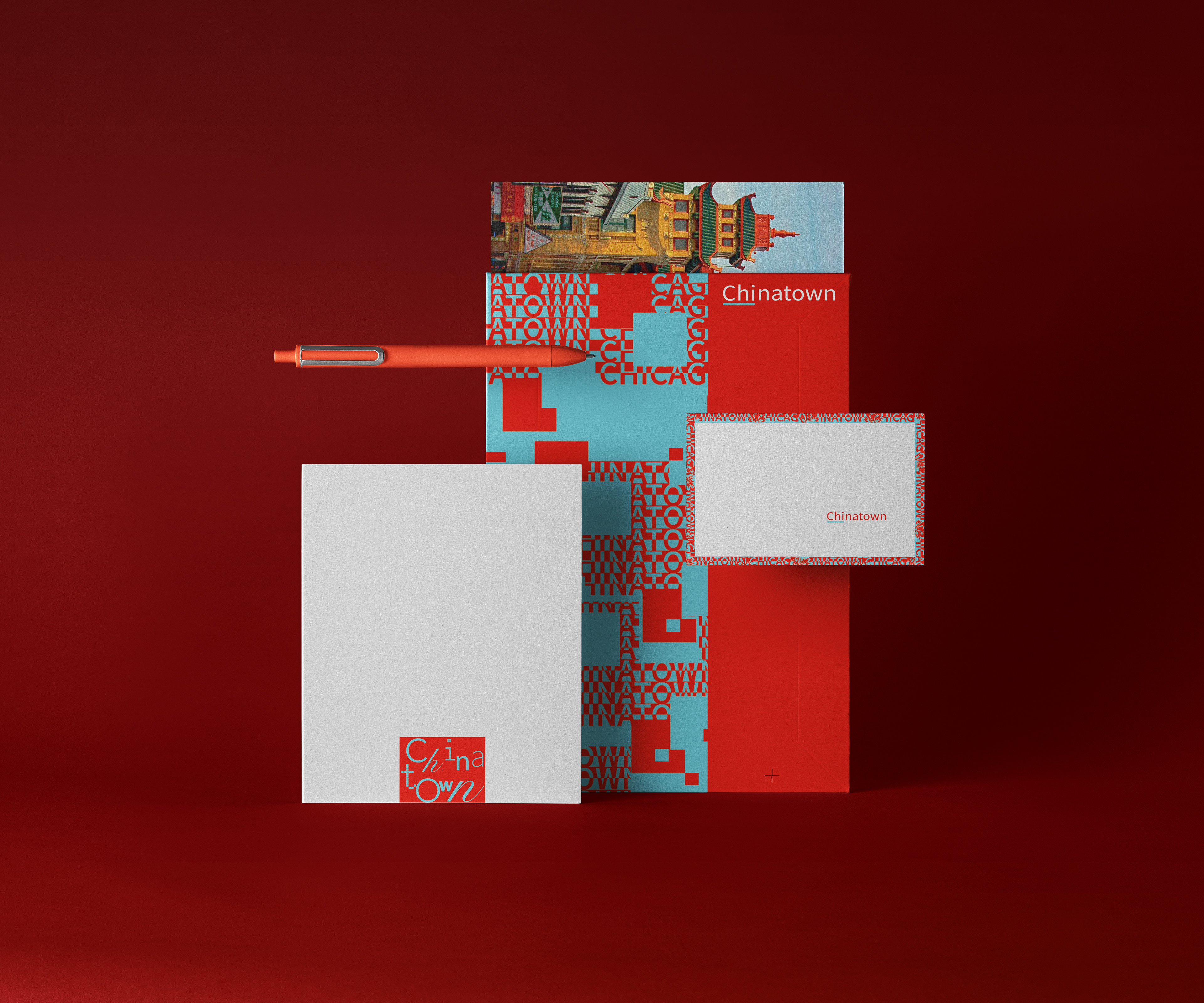
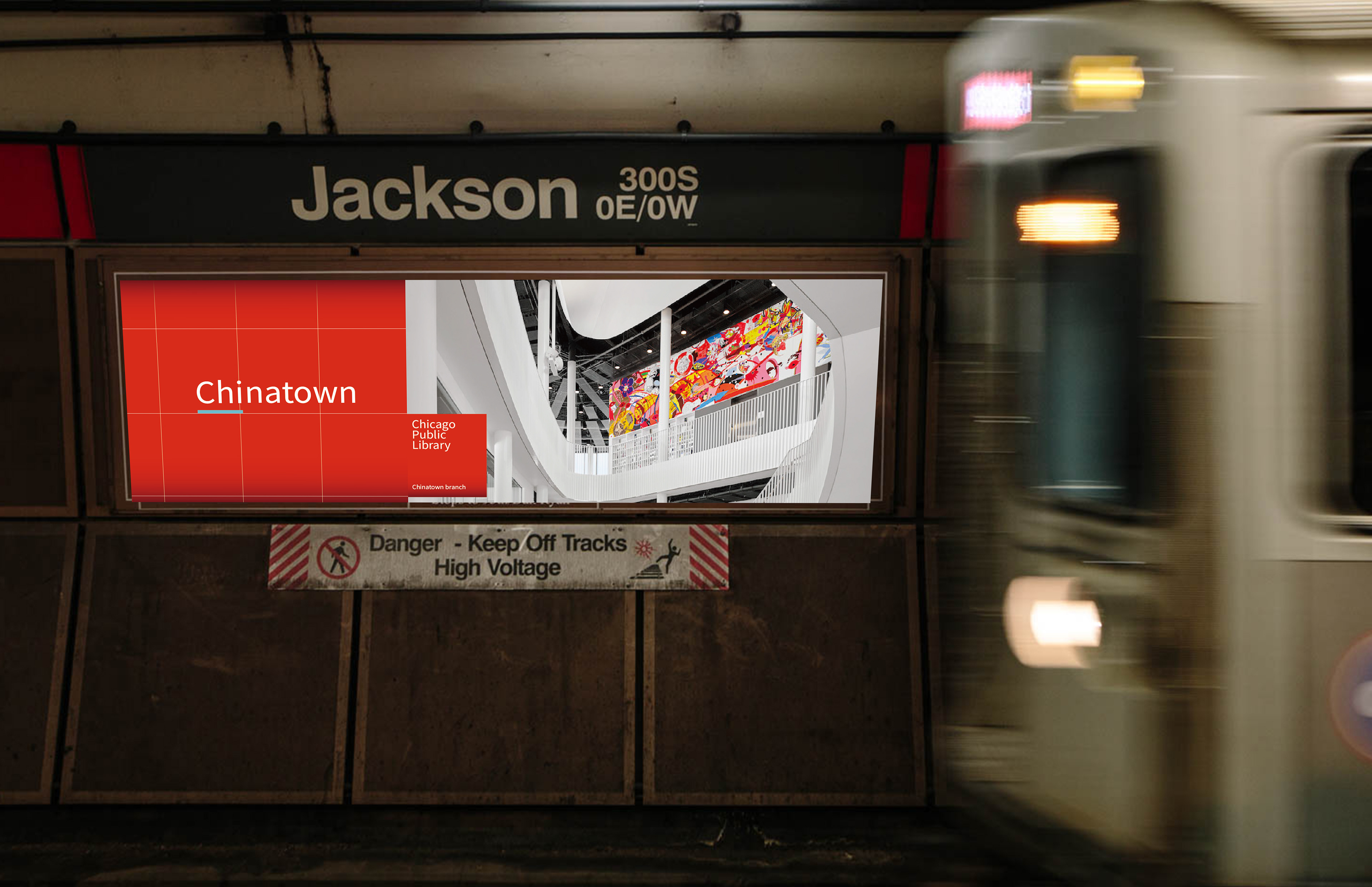
Identity system design for Chicago Chinatown. Inspired by my first visit to Chicago’s Chinatown, I created a new visual identity system to help the neighborhood establish a stronger, more cohesive presence in diverse communities. The design aims to celebrate its unique character with colors inspired by the architecture in Chinatown and Chicago's city flag, and support community growth by attracting more visitors and businesses with modern and sleek design elements.
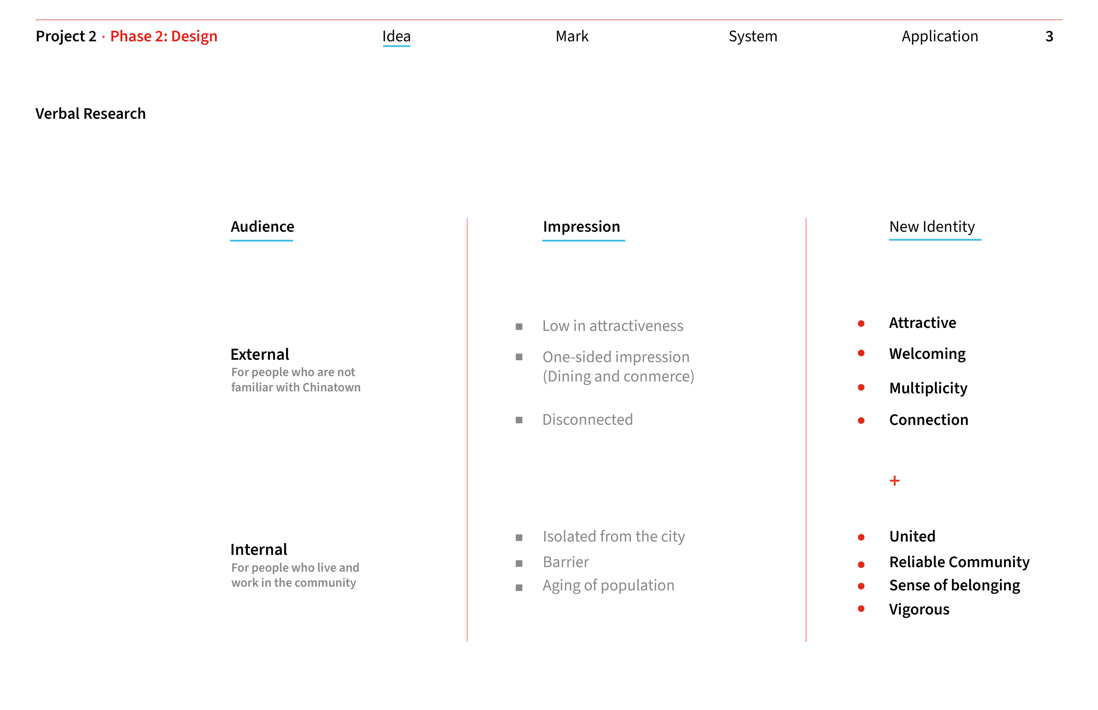
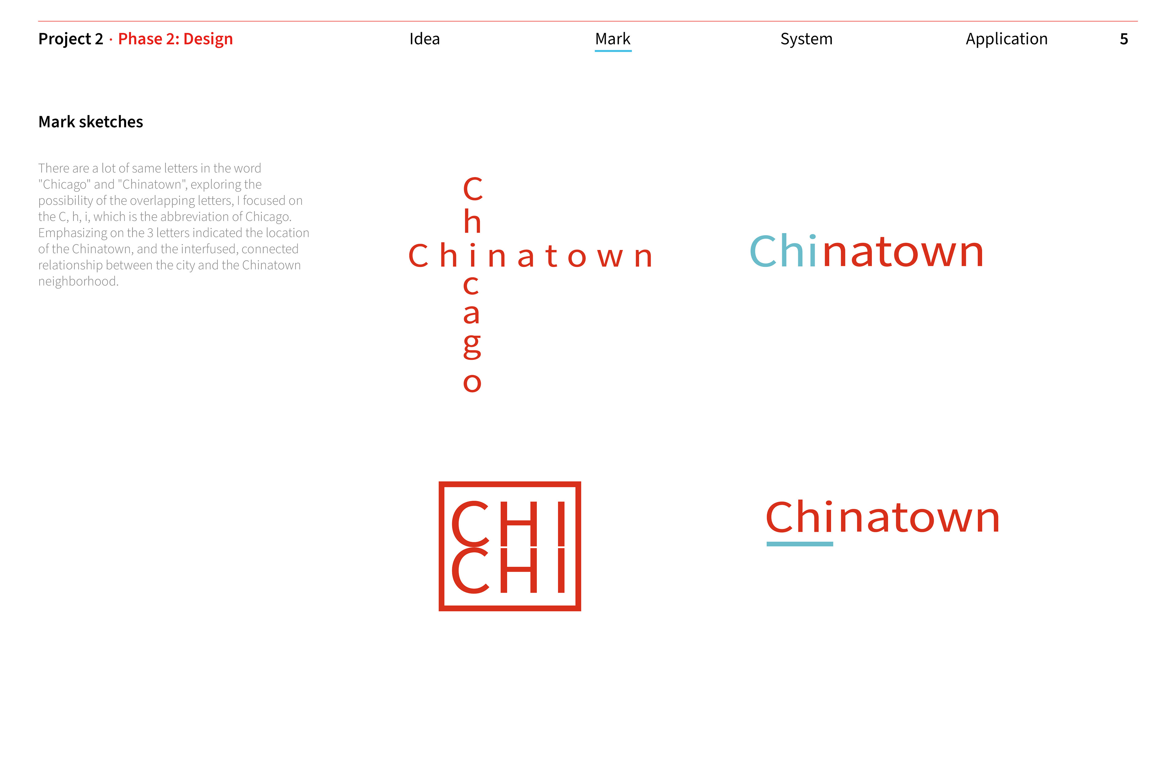
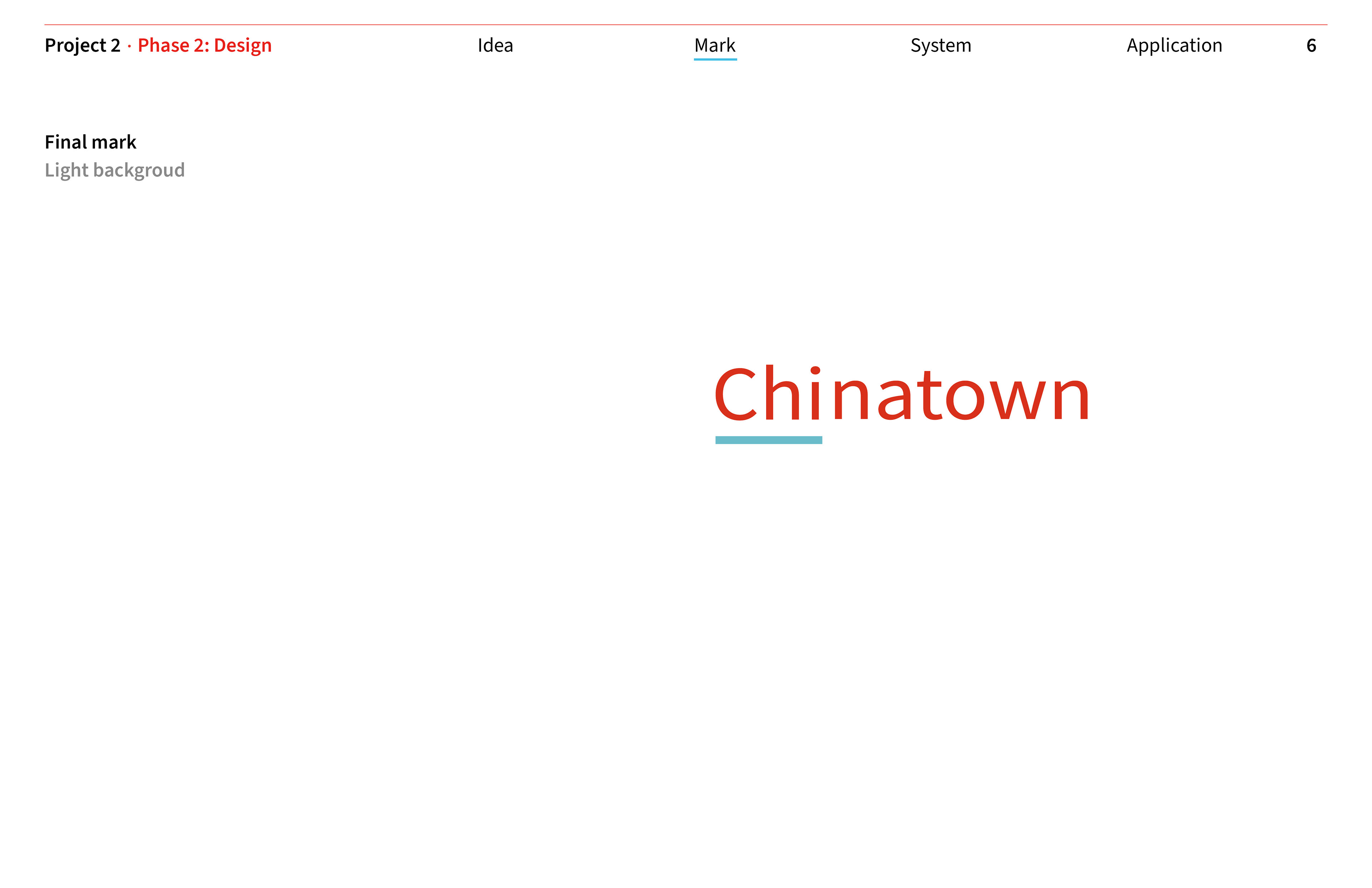
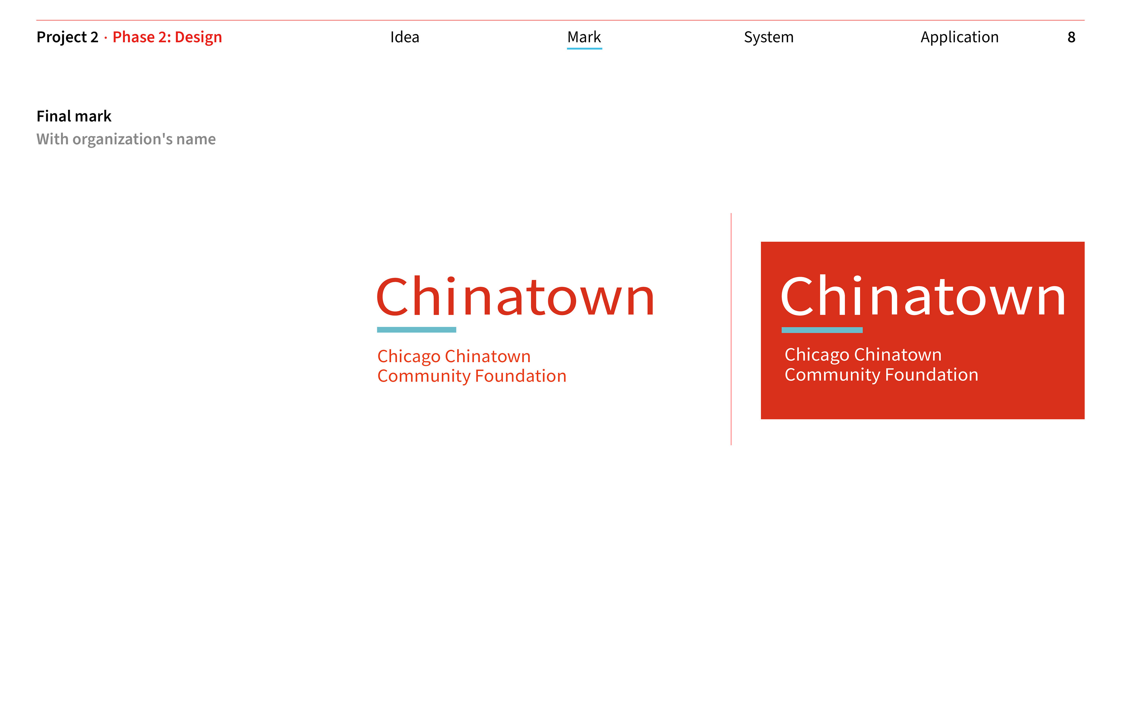
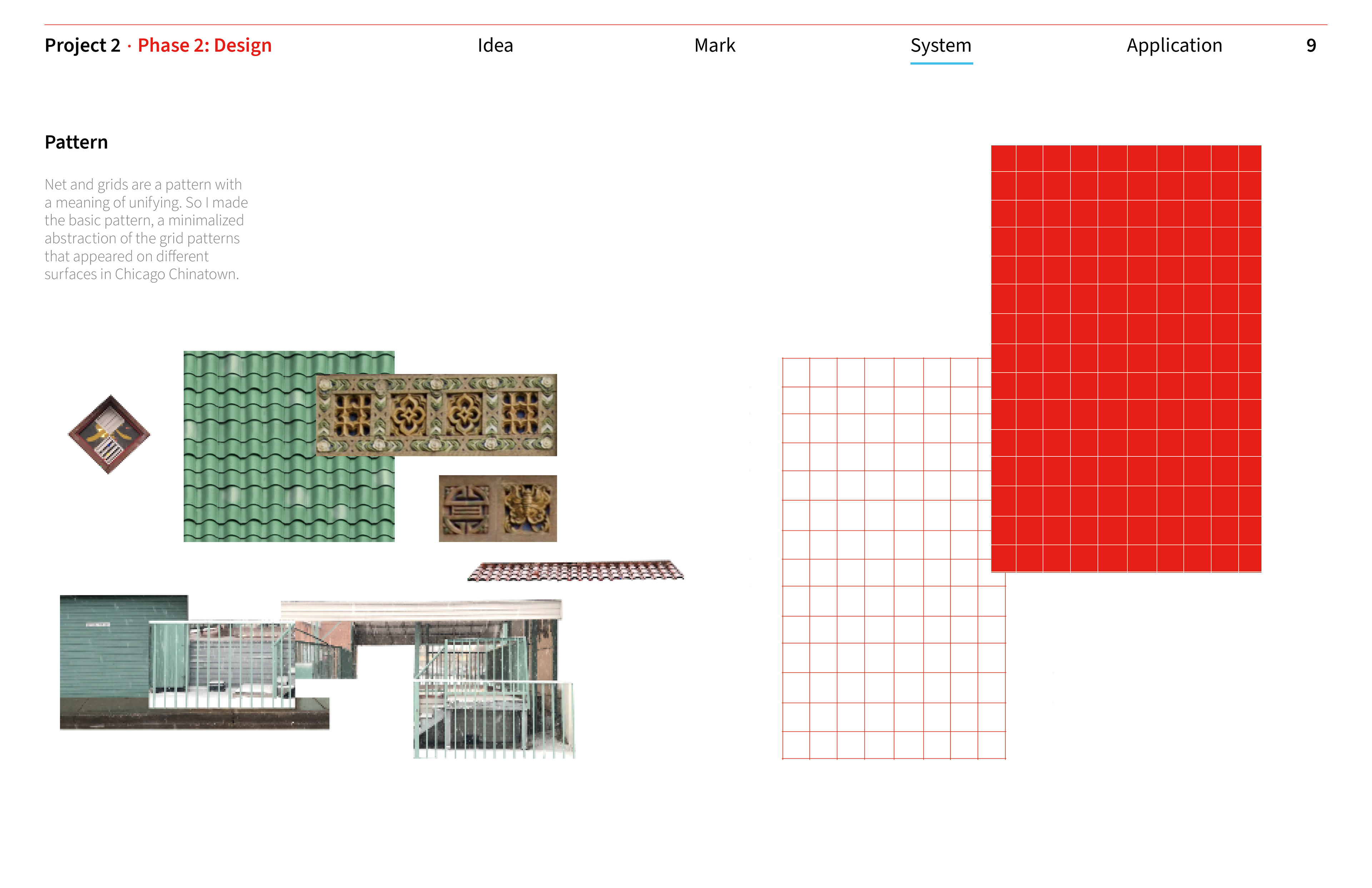
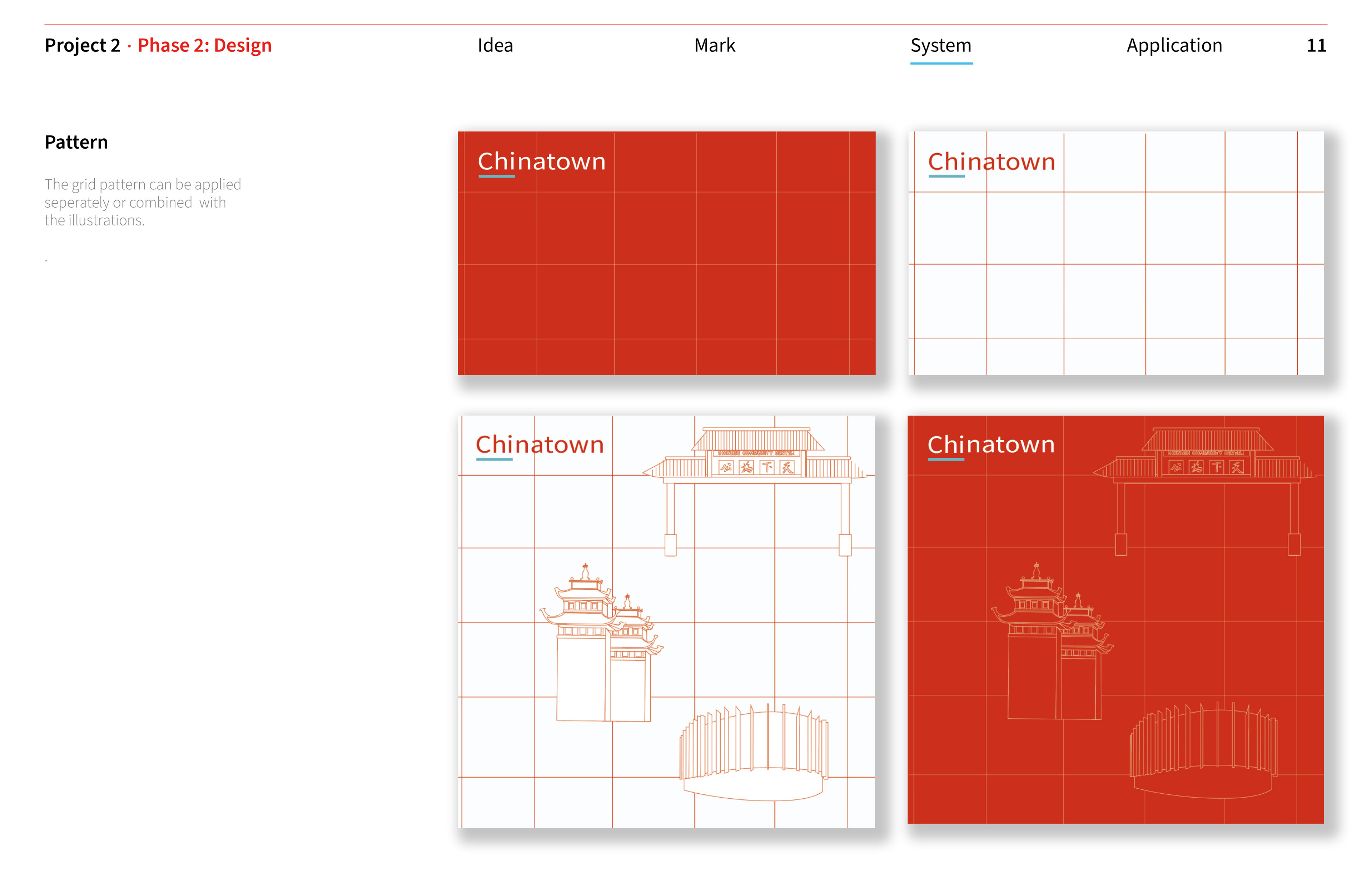
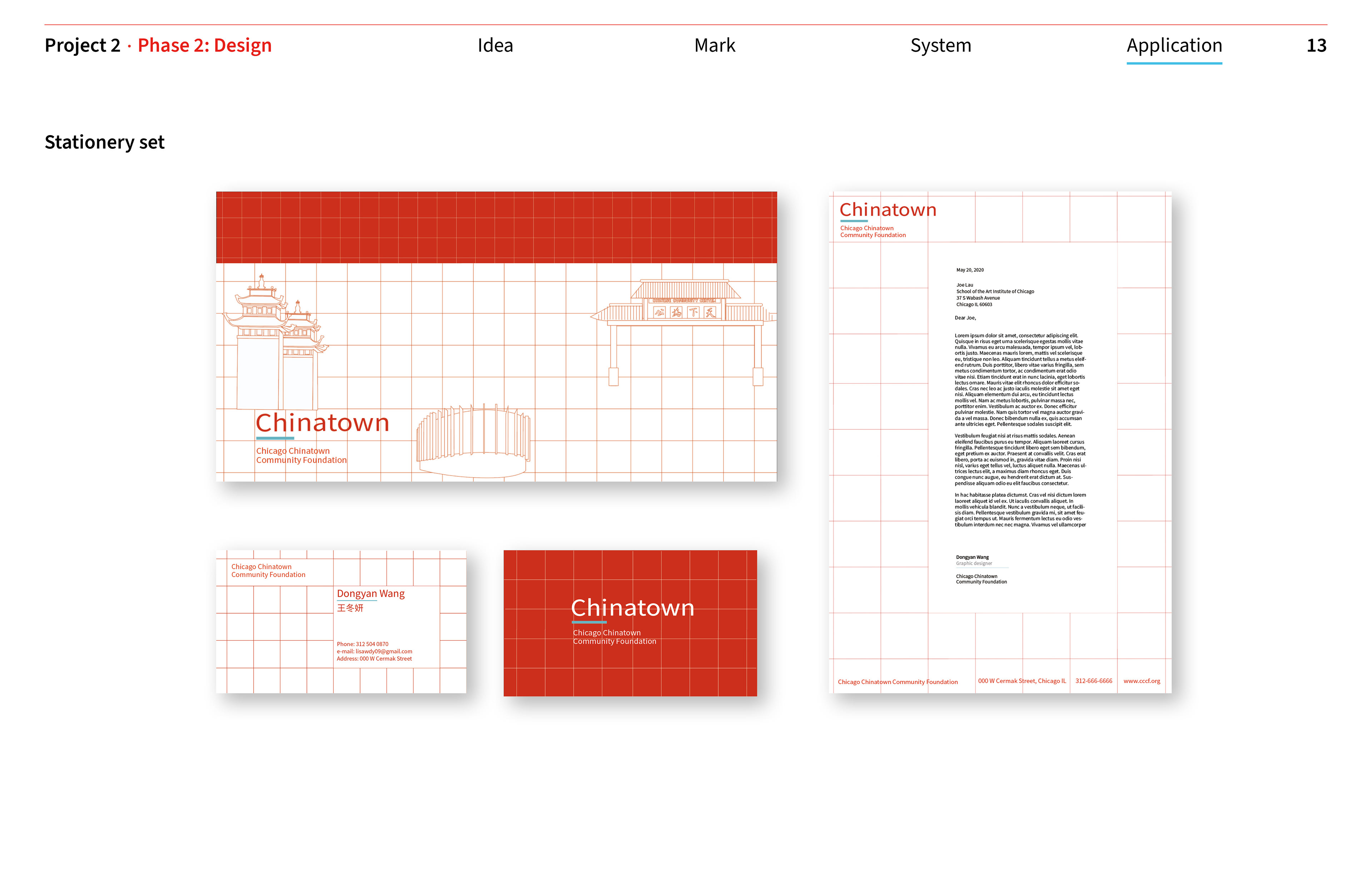
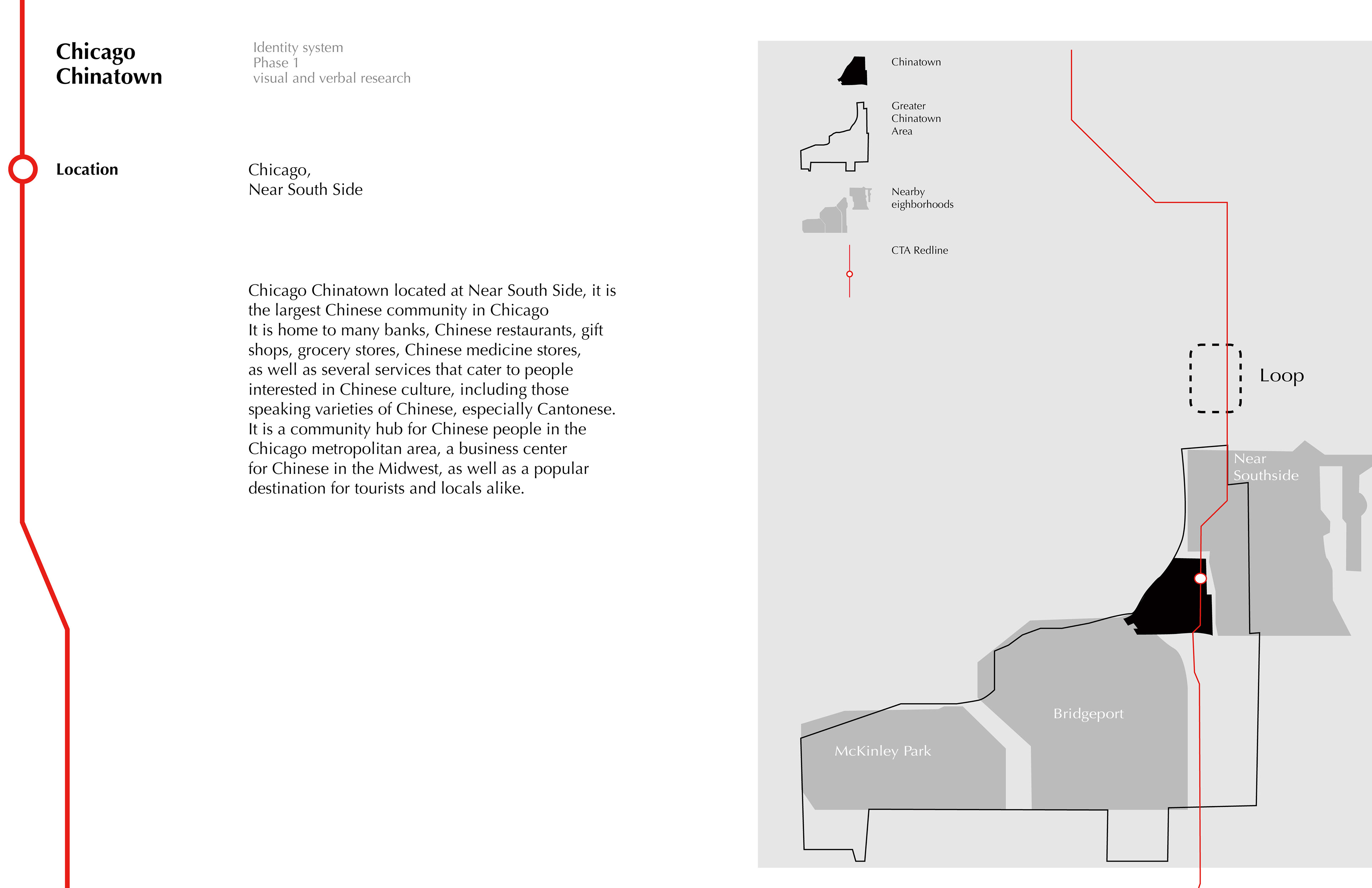
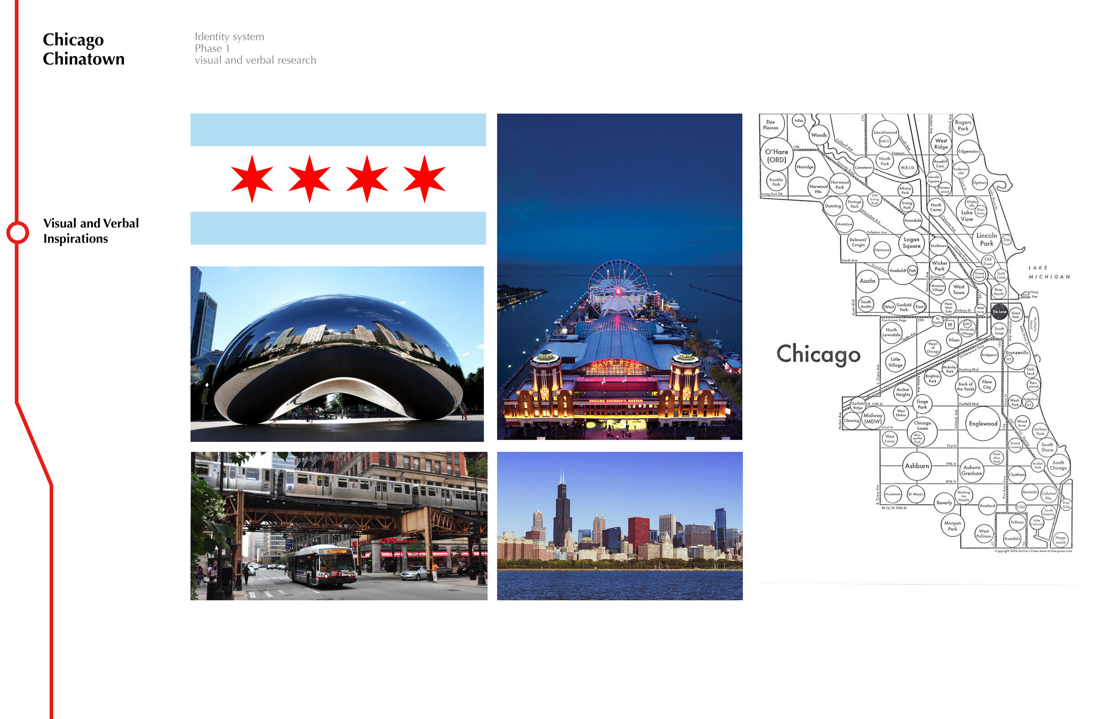
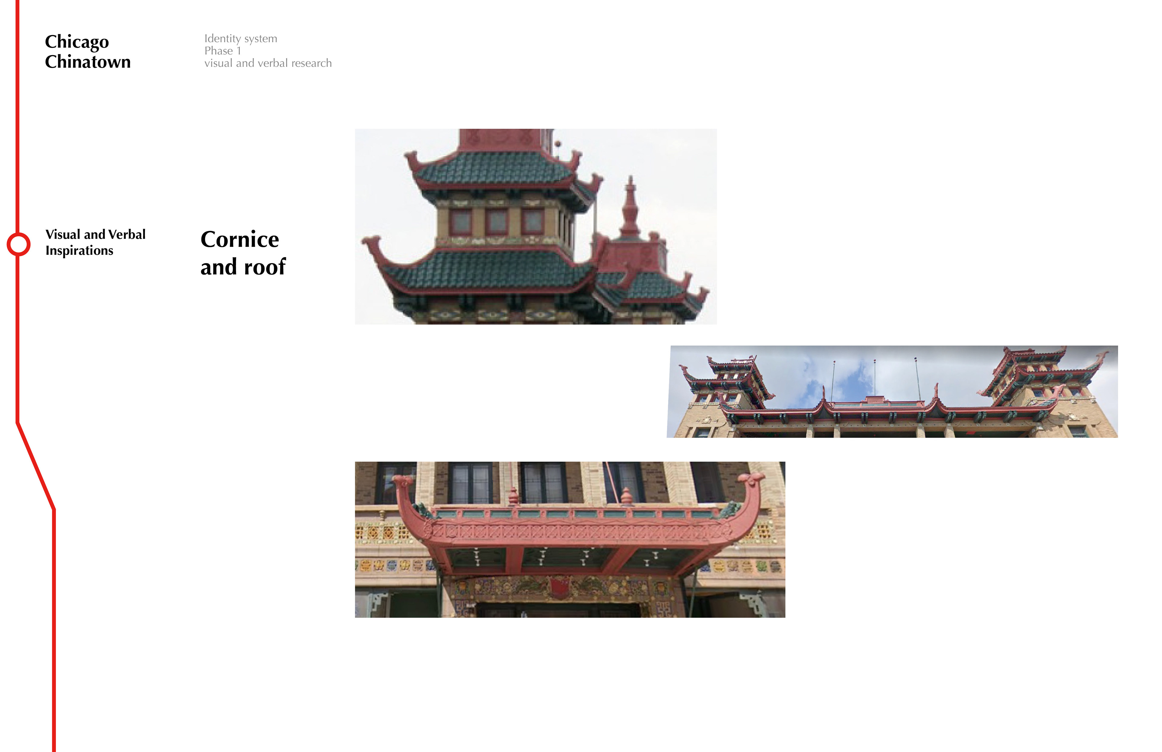
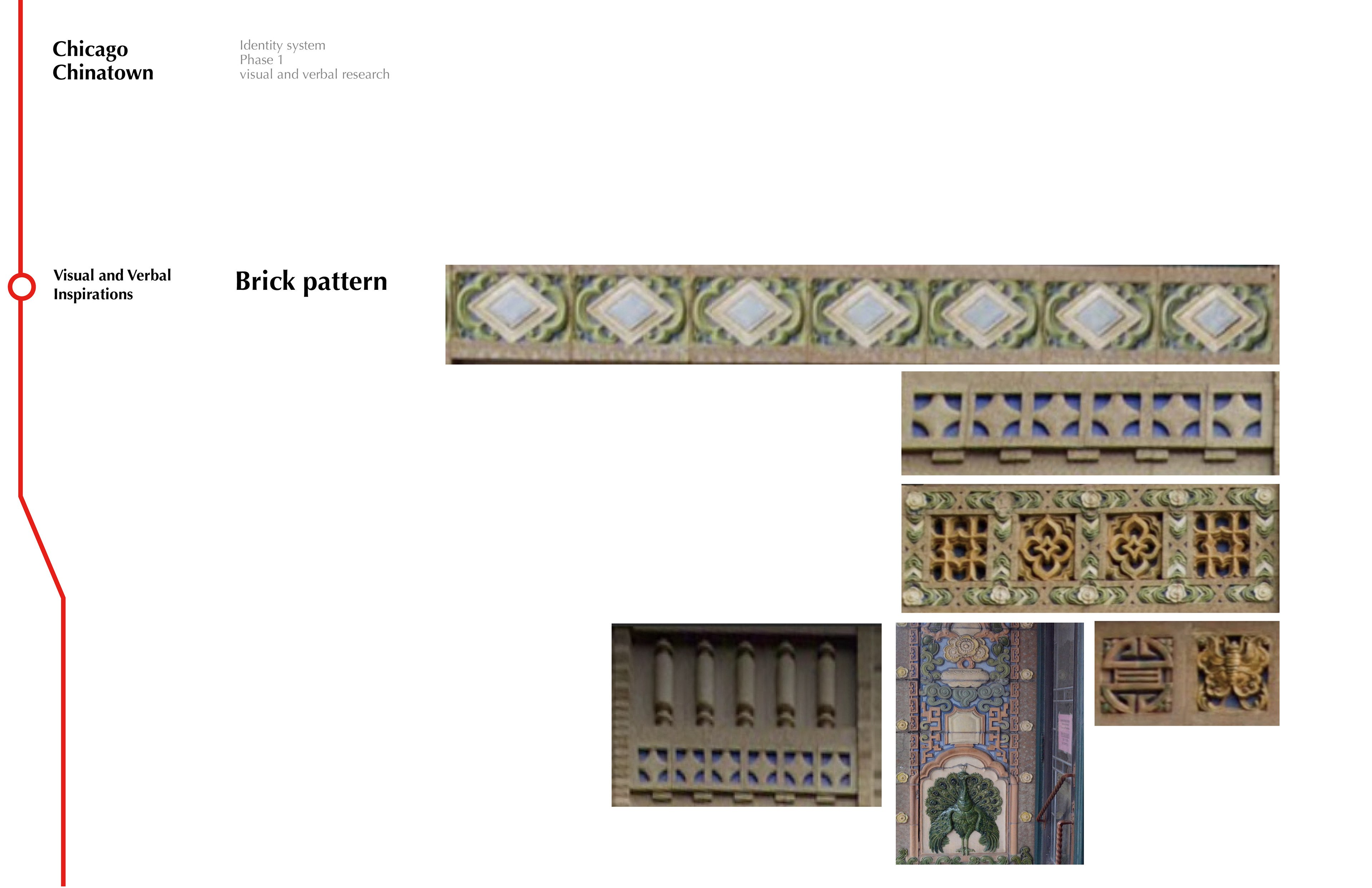
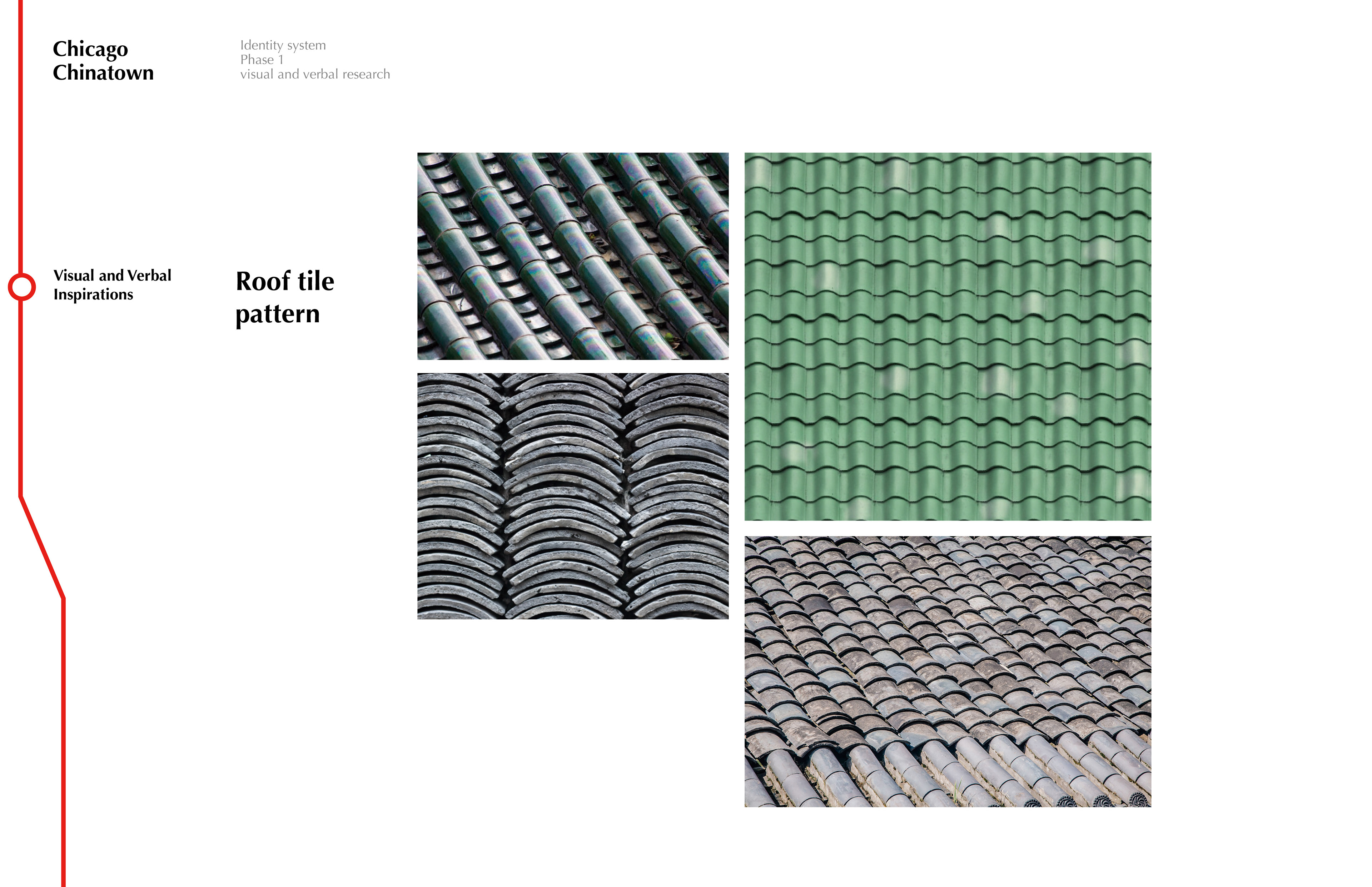
Started with visual and verbal research, I got inspiration from the Chinese immigrant history in Chicago, the location, the architectural style and details, the shop signs, as well as the colors that were widely used in the facade of the architecture in Chicago Chinatown. As it was located to the south of the CTA Red line, and red is a color that is traditionally representing joy and luck in Chinese culture, I decided to use red as the main color of the identity system at the research stage.

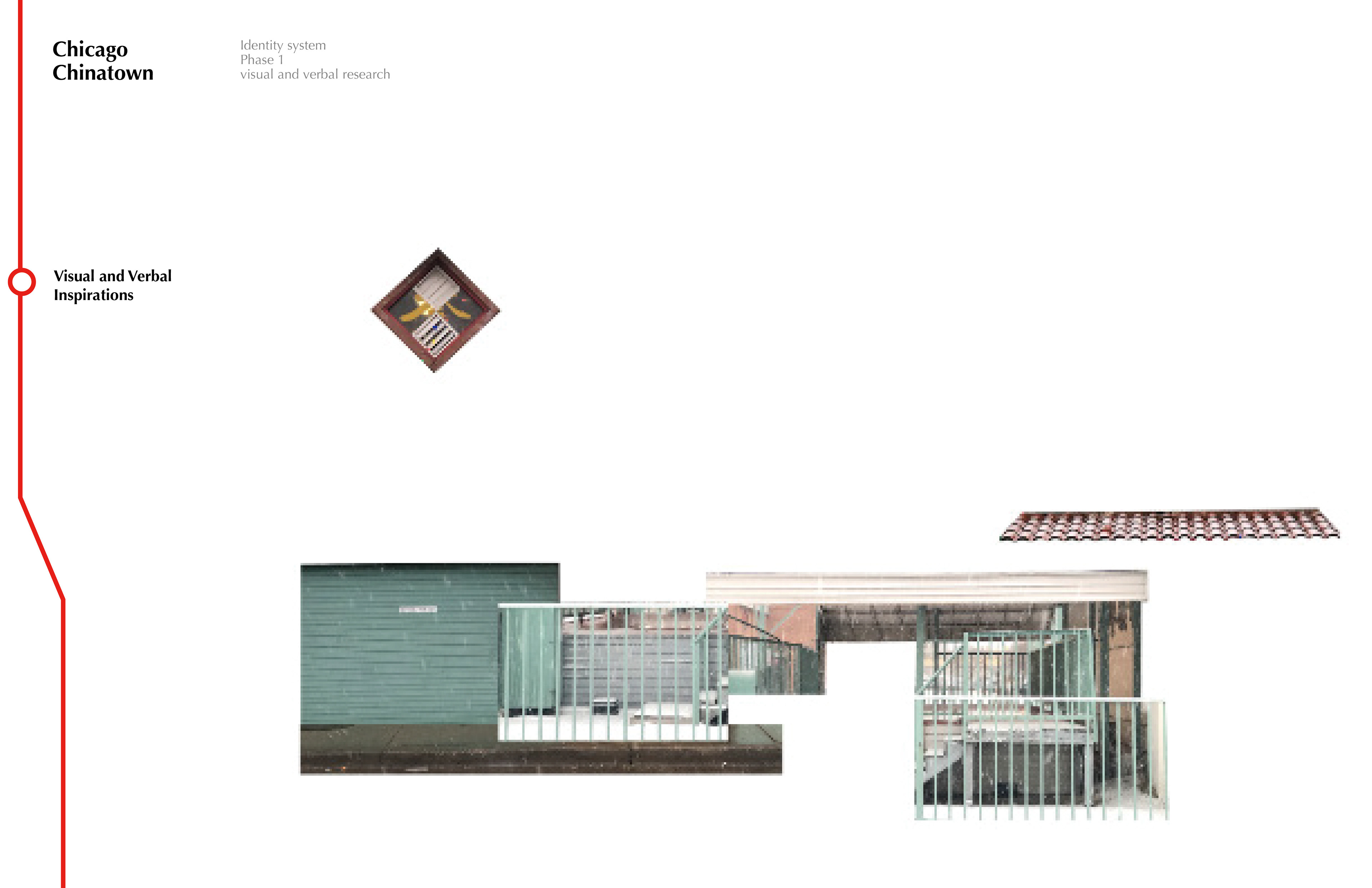
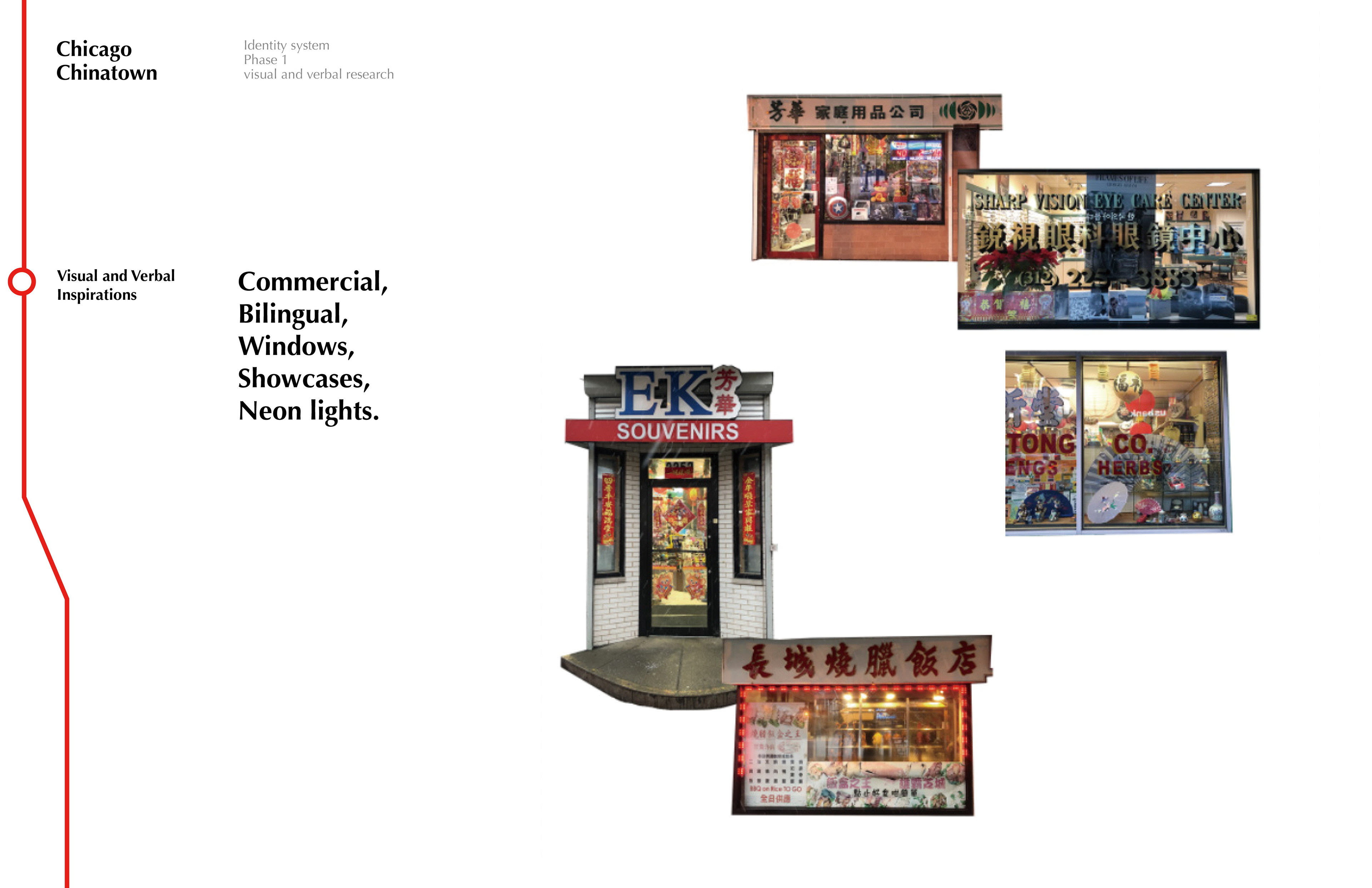


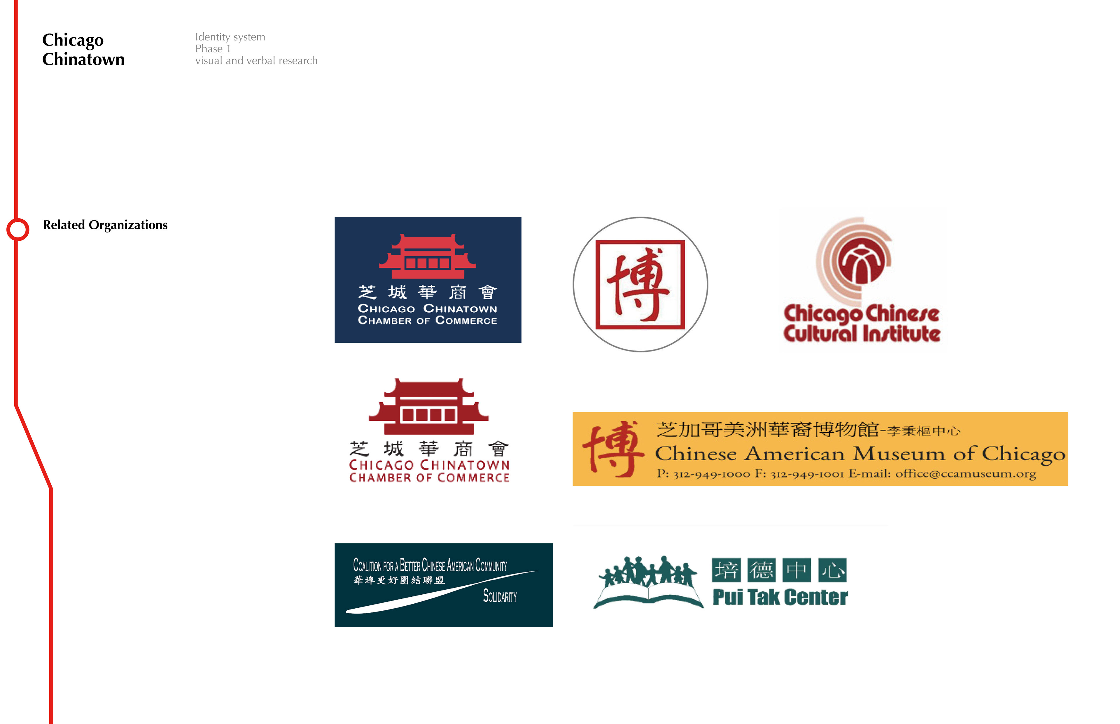
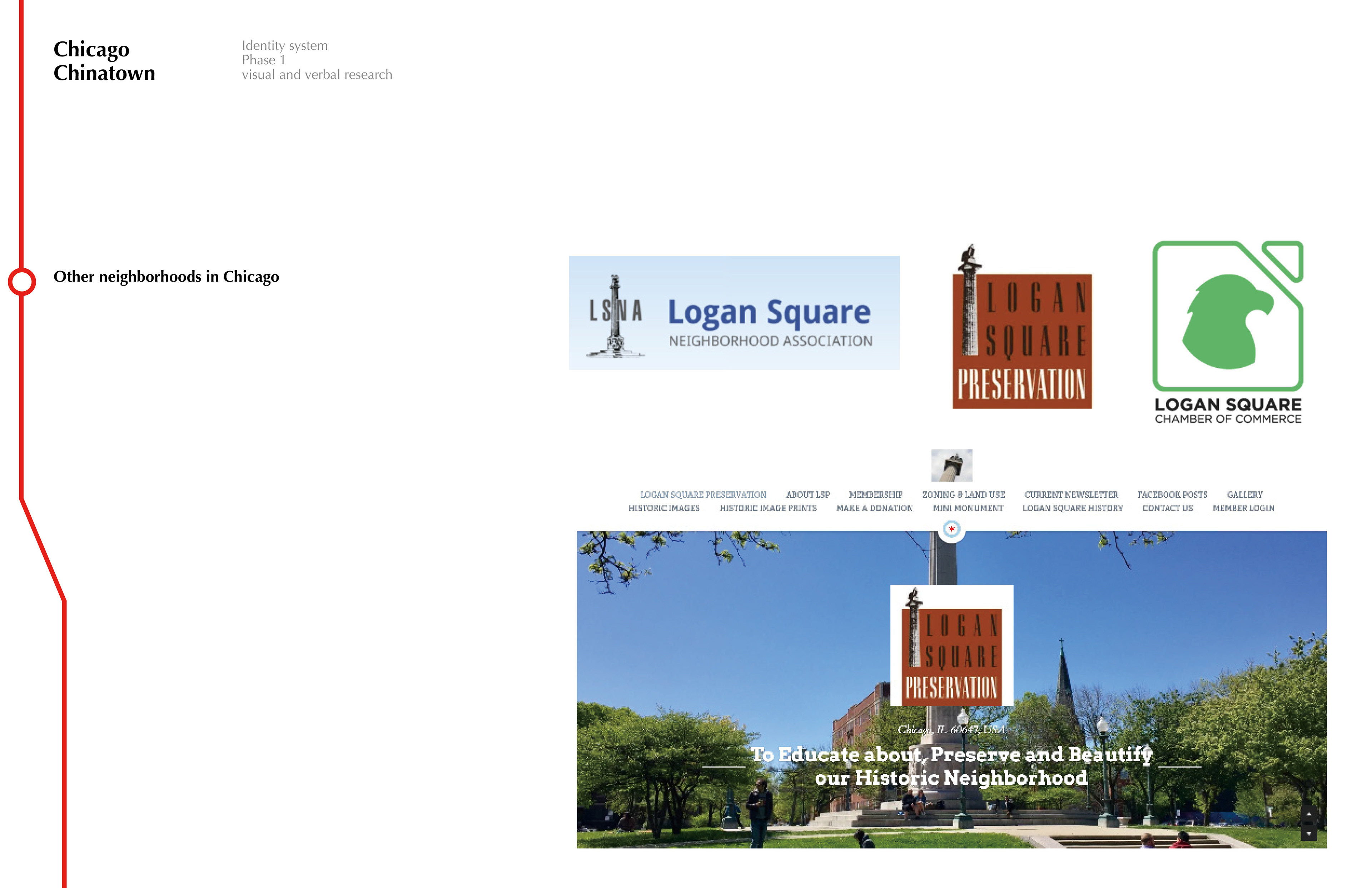
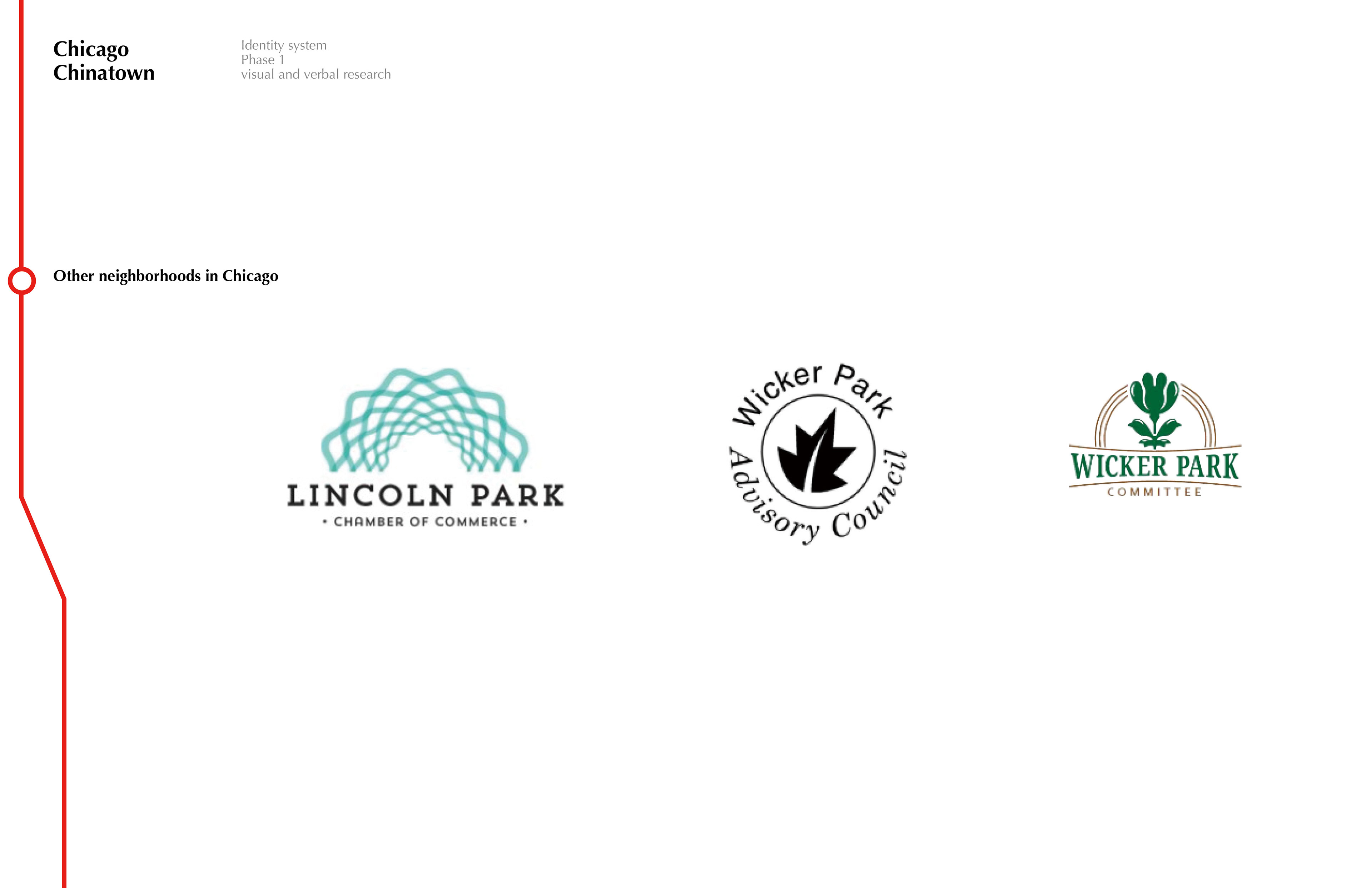
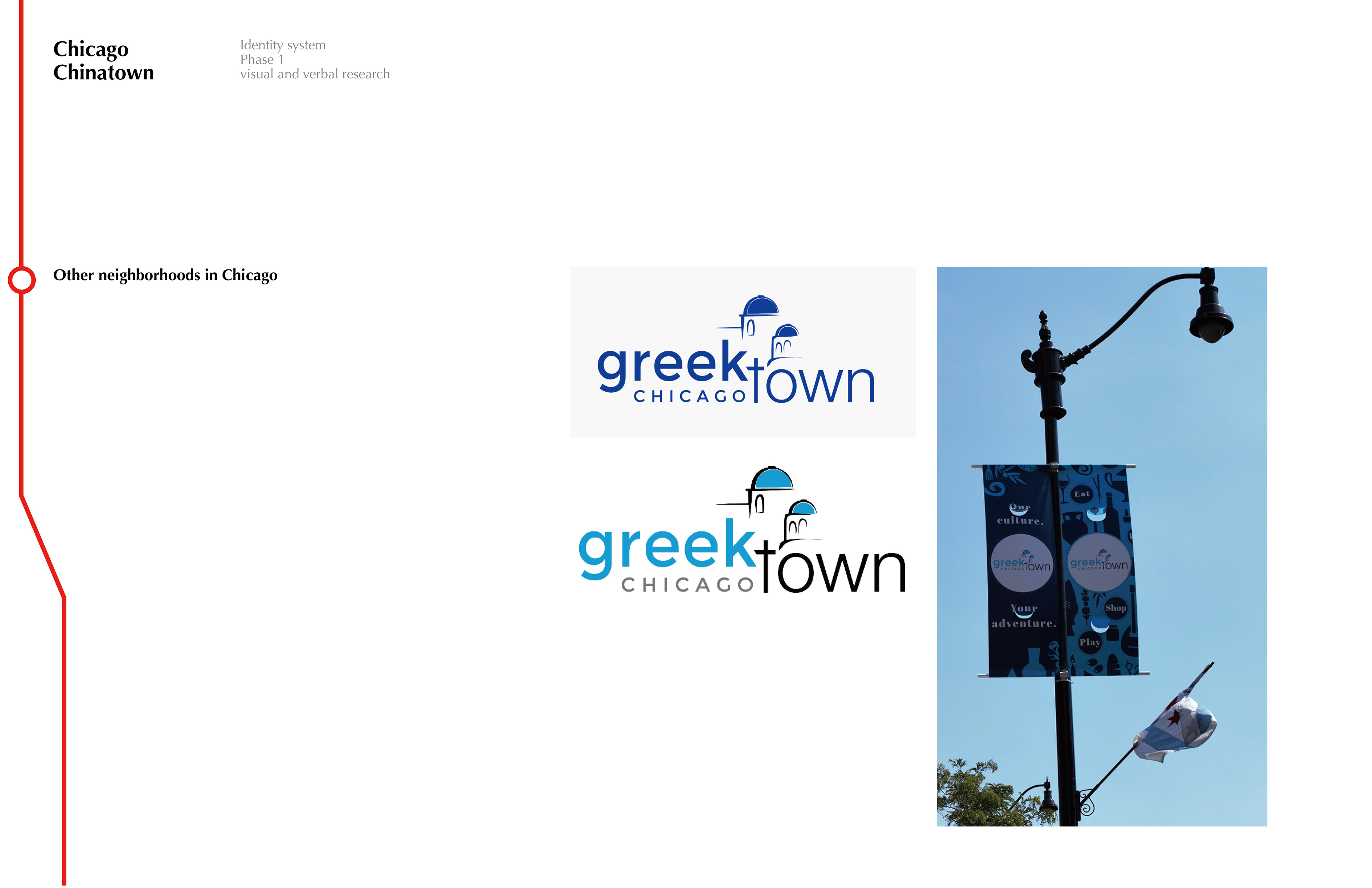
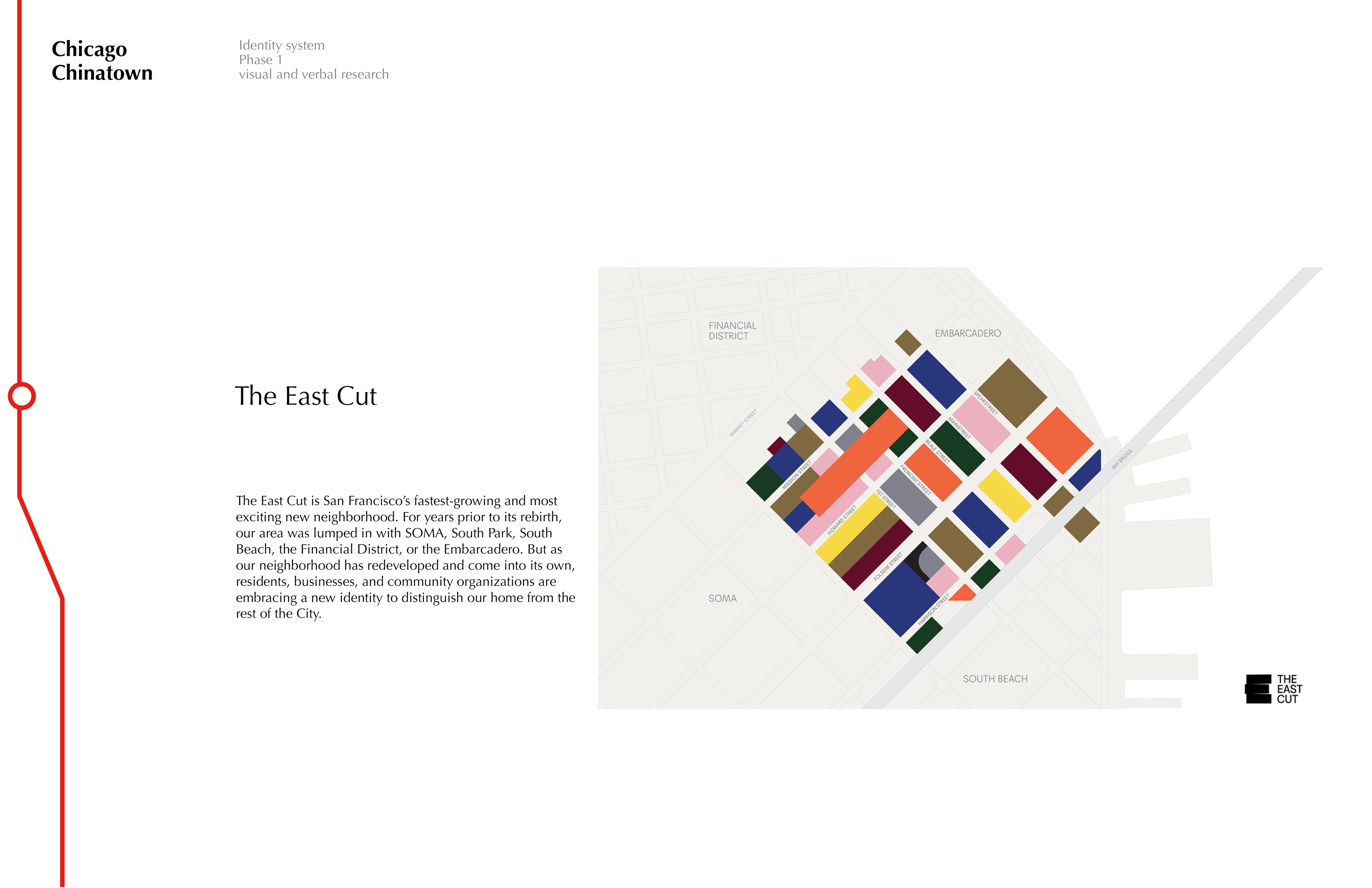
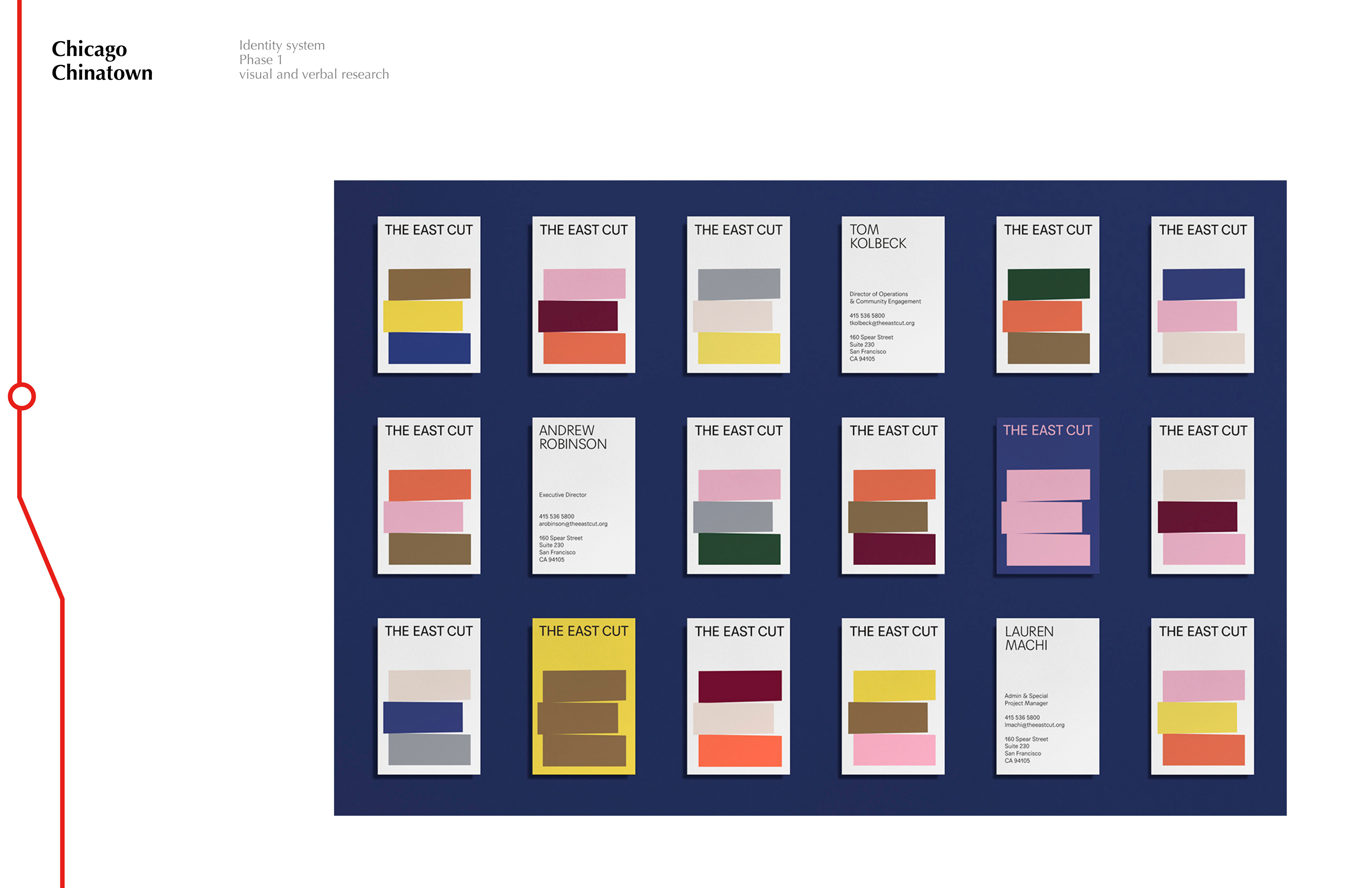
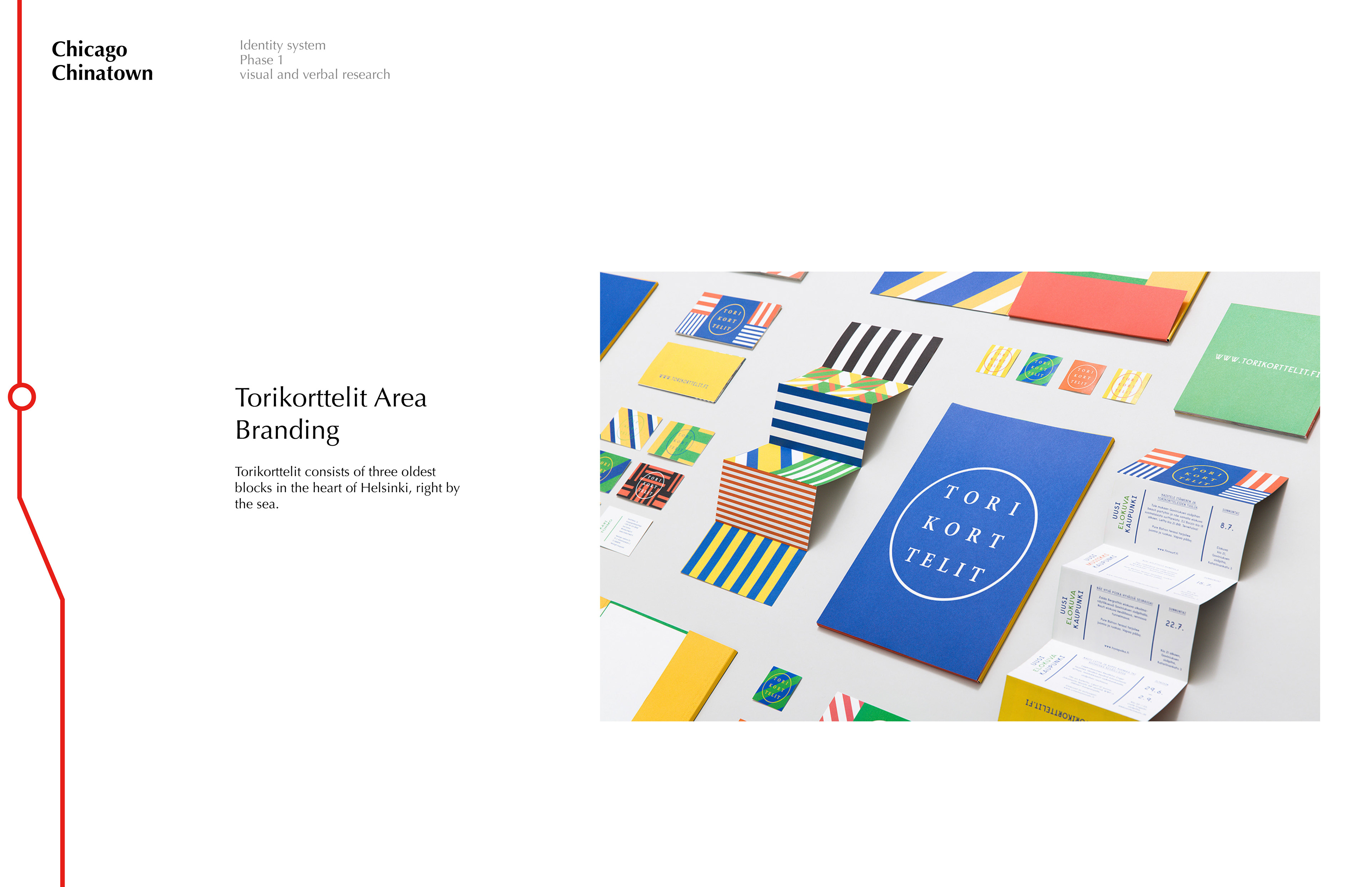
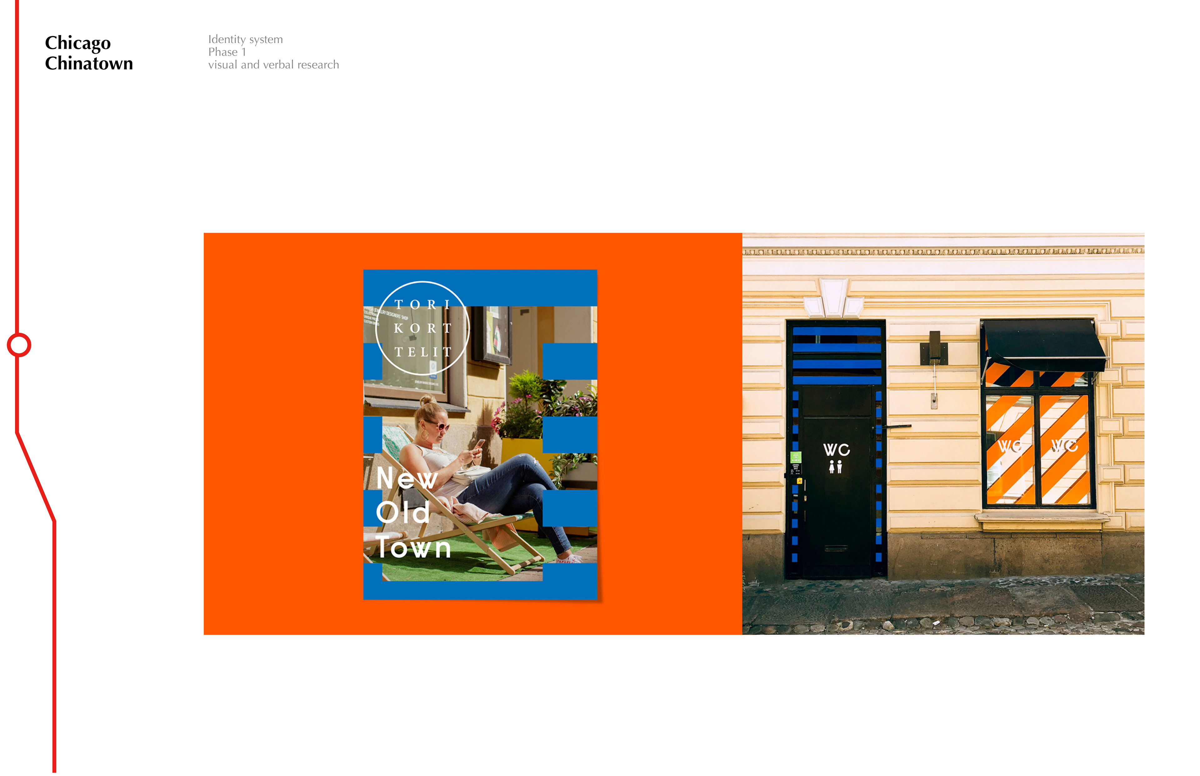
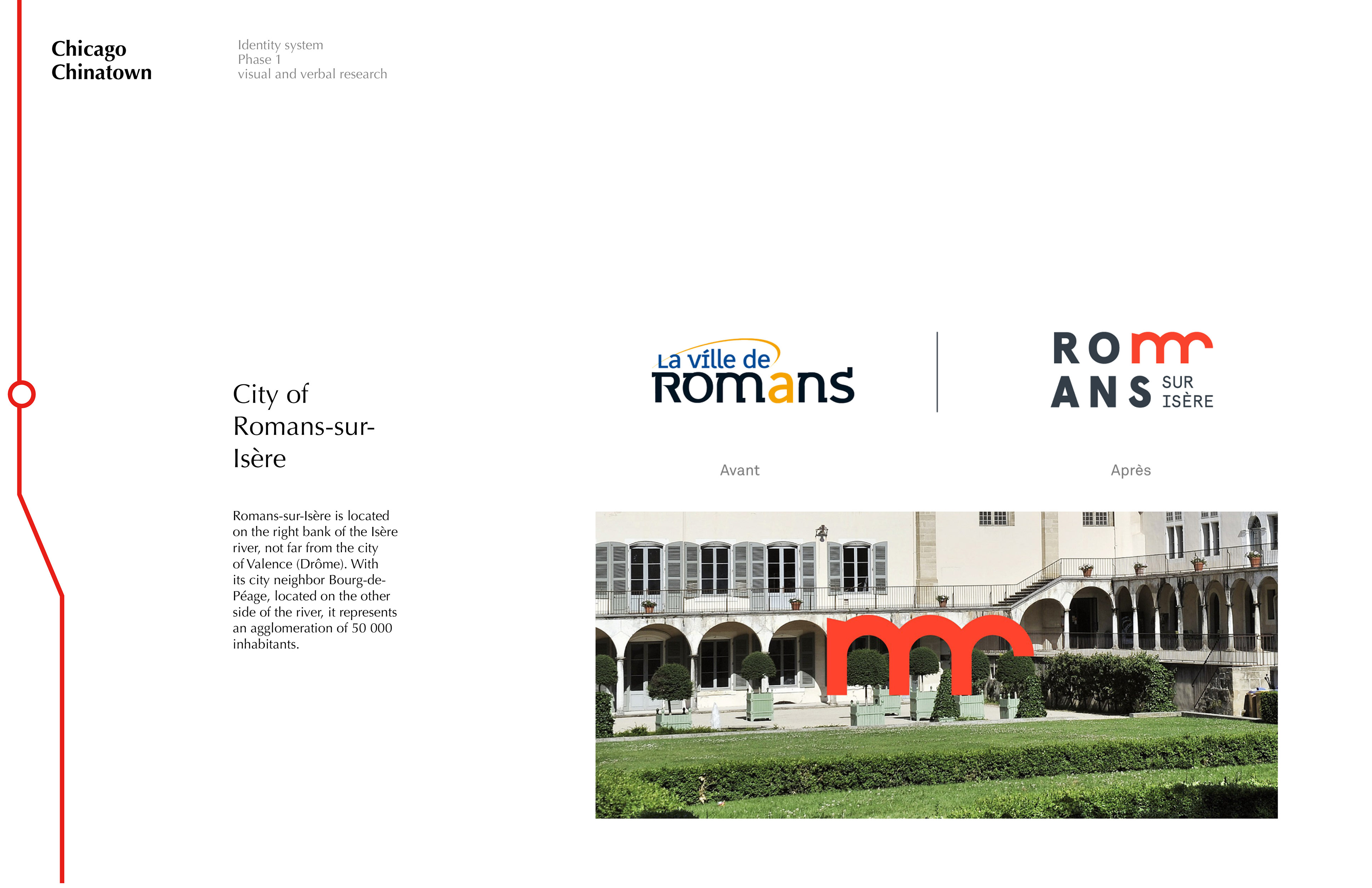
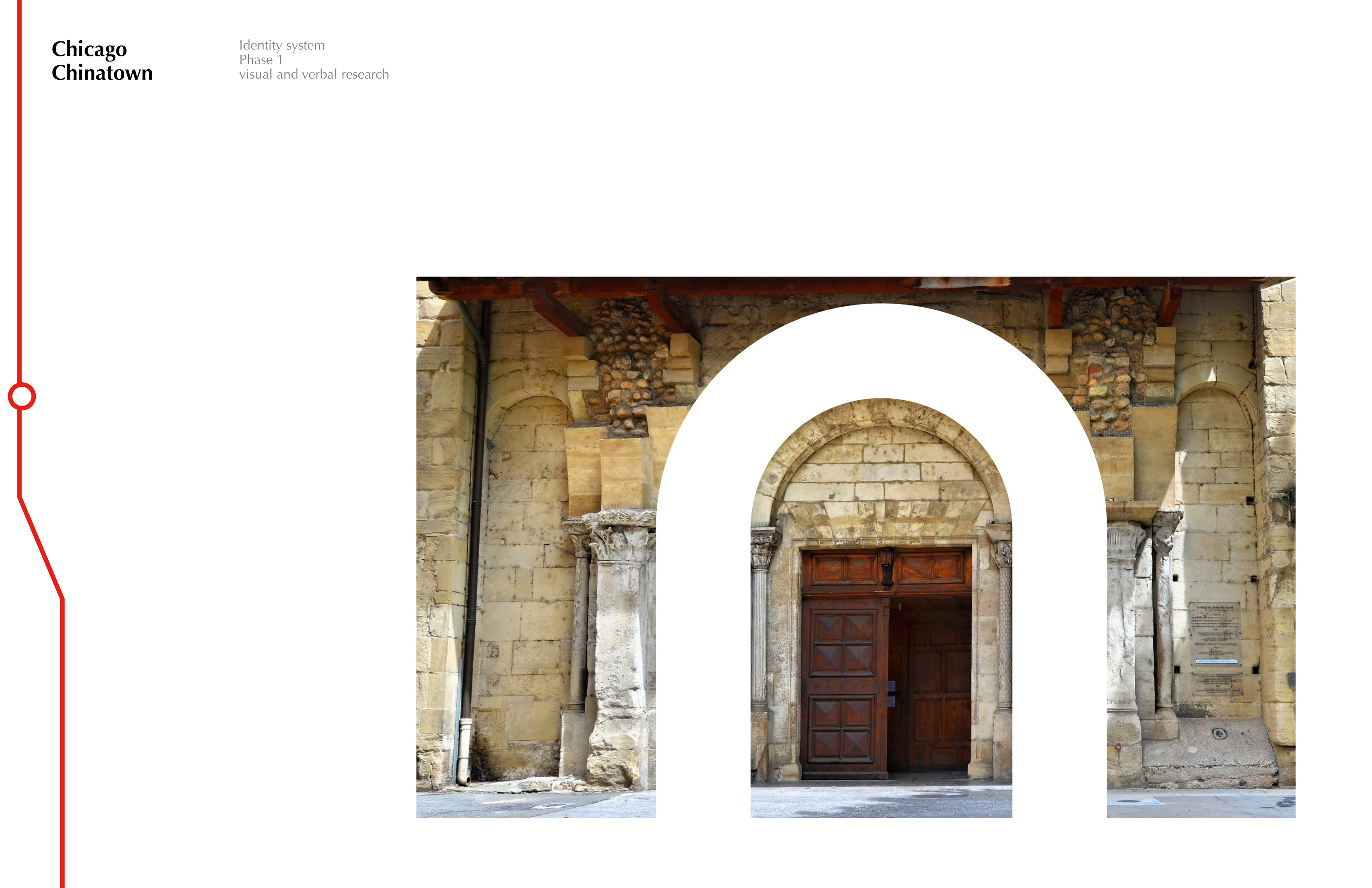
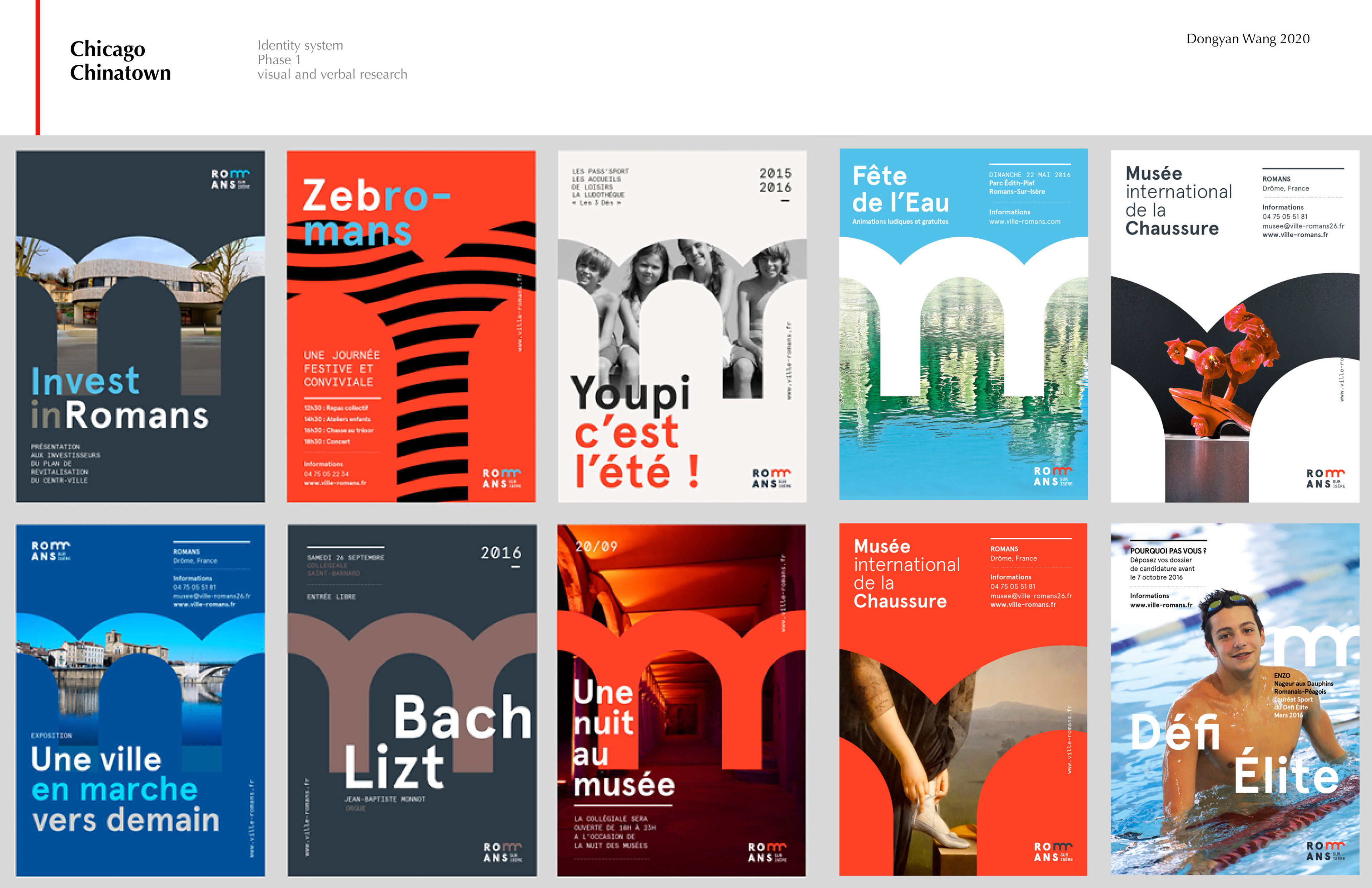
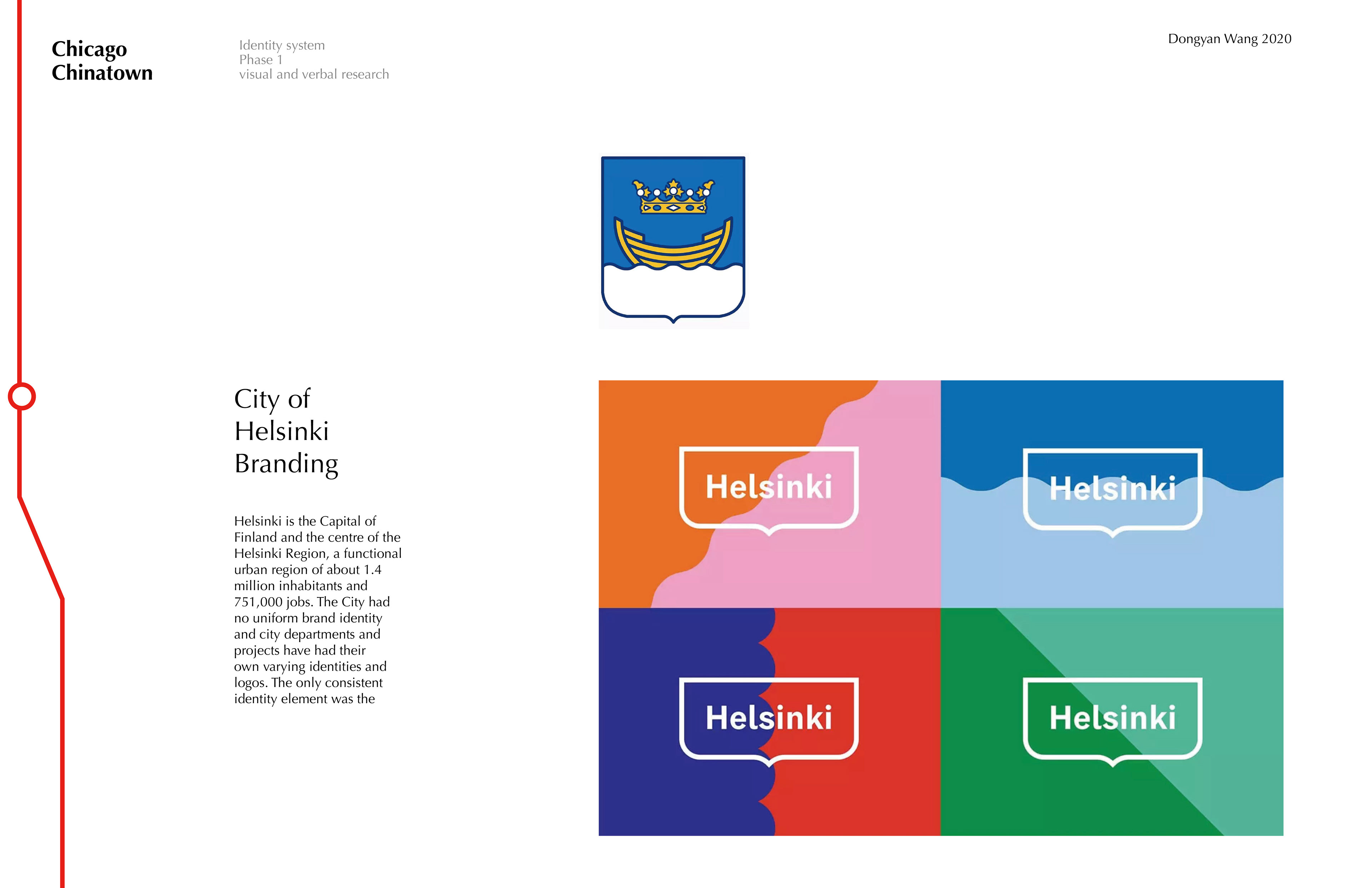
I collected the visual materials that were used by the Chicago Chinatown community over the past few years, the identity system of other neighborhoods in Chicago, and also the design references of the region-based identity system design.